Etmmam Contracting Company is a leading Saudi company in the field of building and construction, specialized in the implementation of residential, commercial and industrial projects according to the highest standards of quality and professionalism. Since its inception, the company has set its sights on achieving excellence by providing integrated solutions that include construction and infrastructure work, with strict adherence to the schedule and customer requirements.
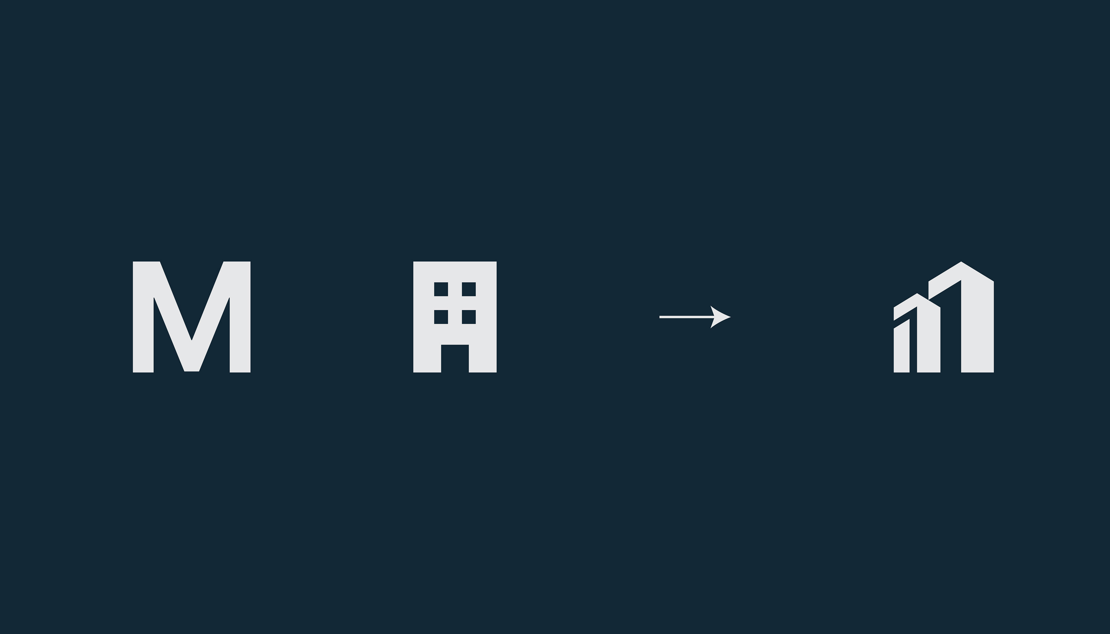
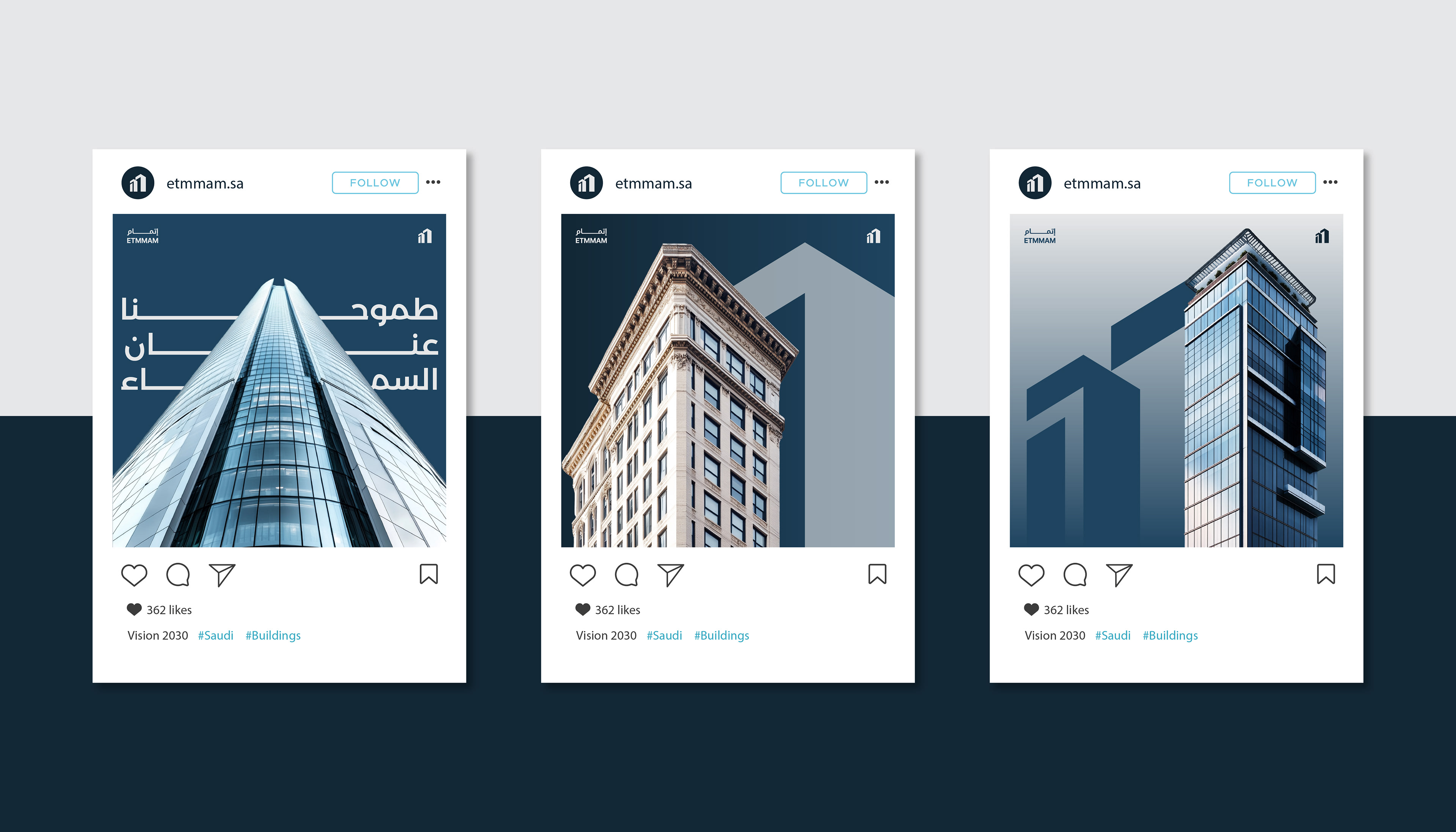
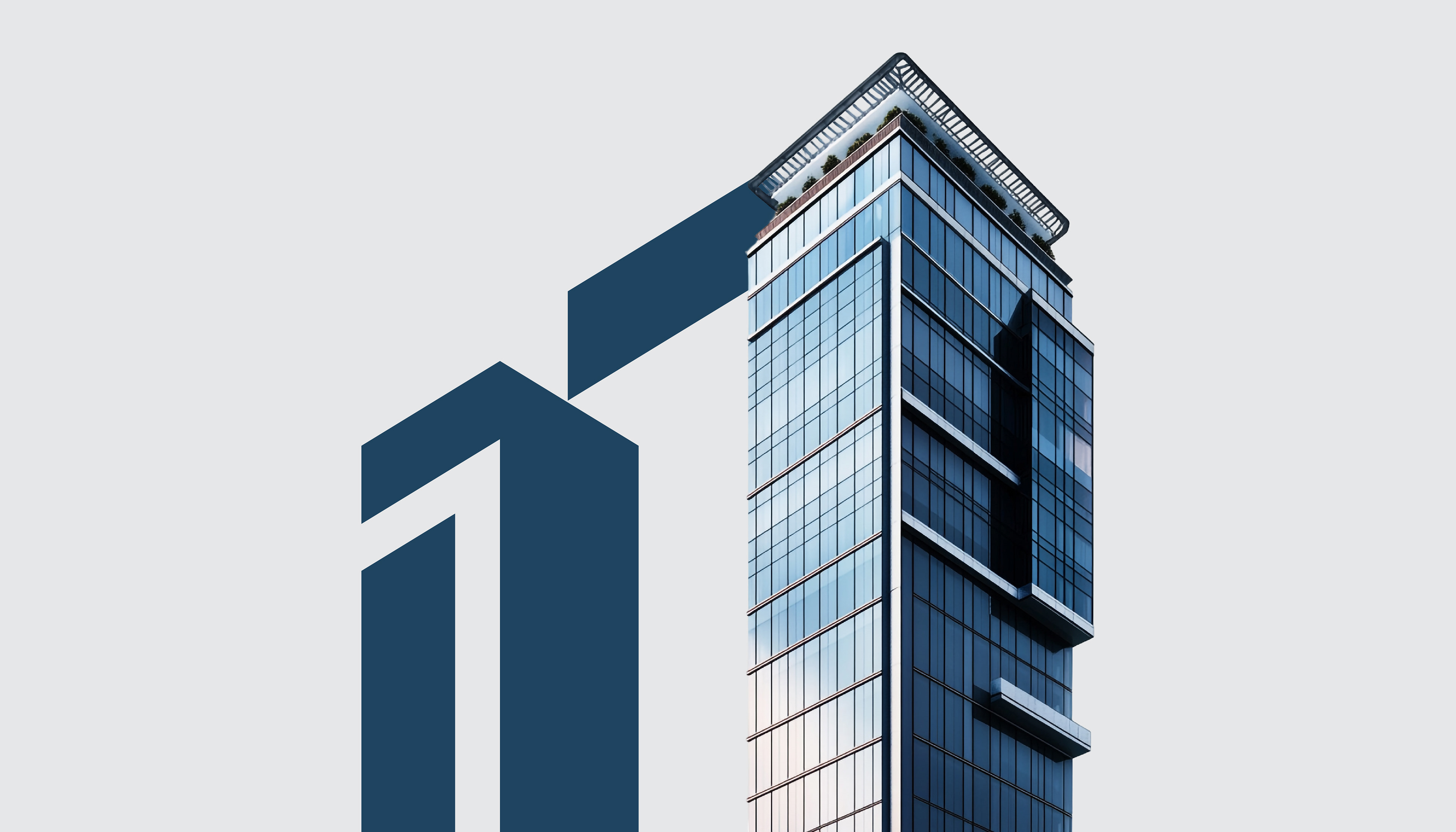
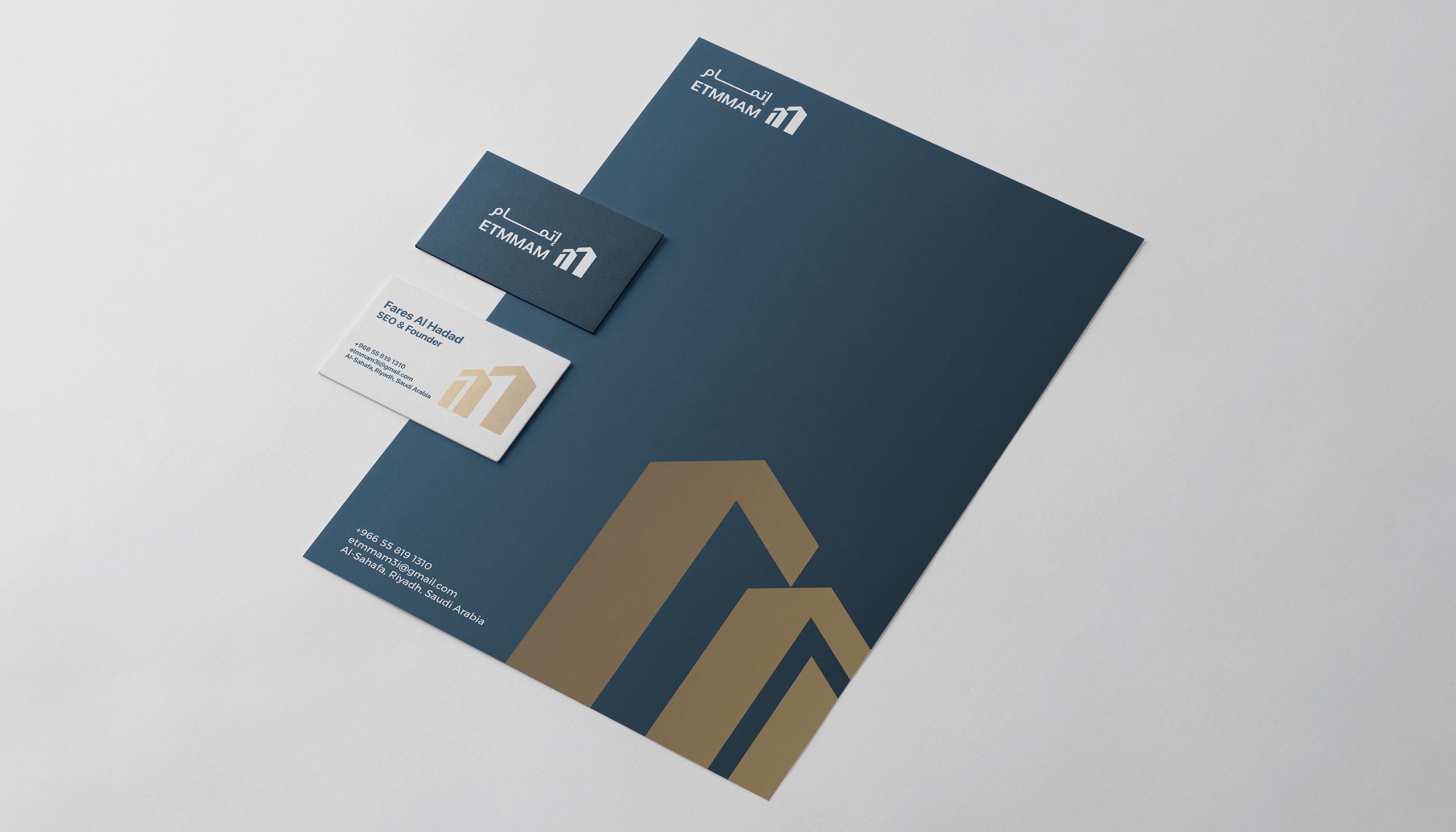
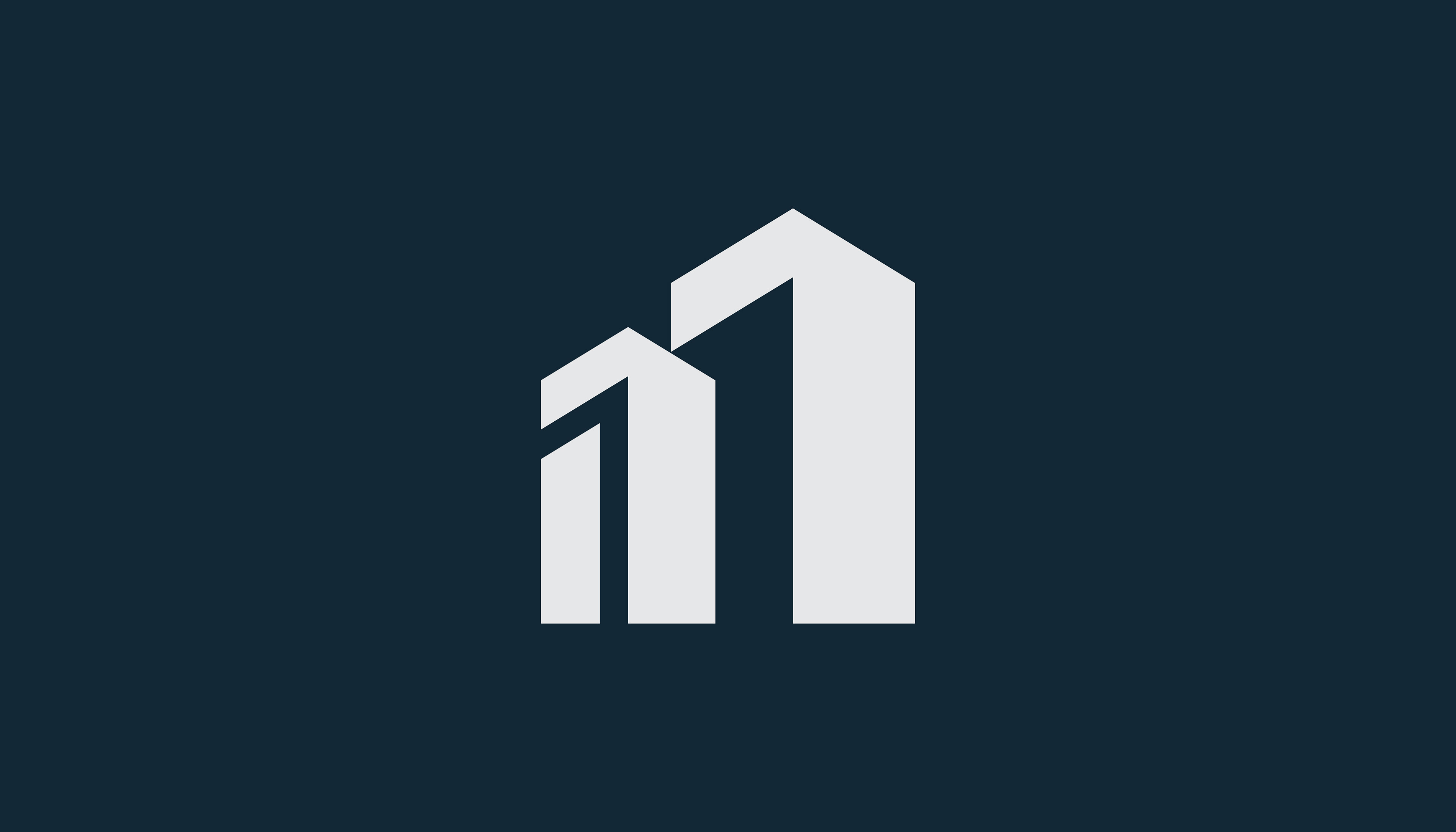
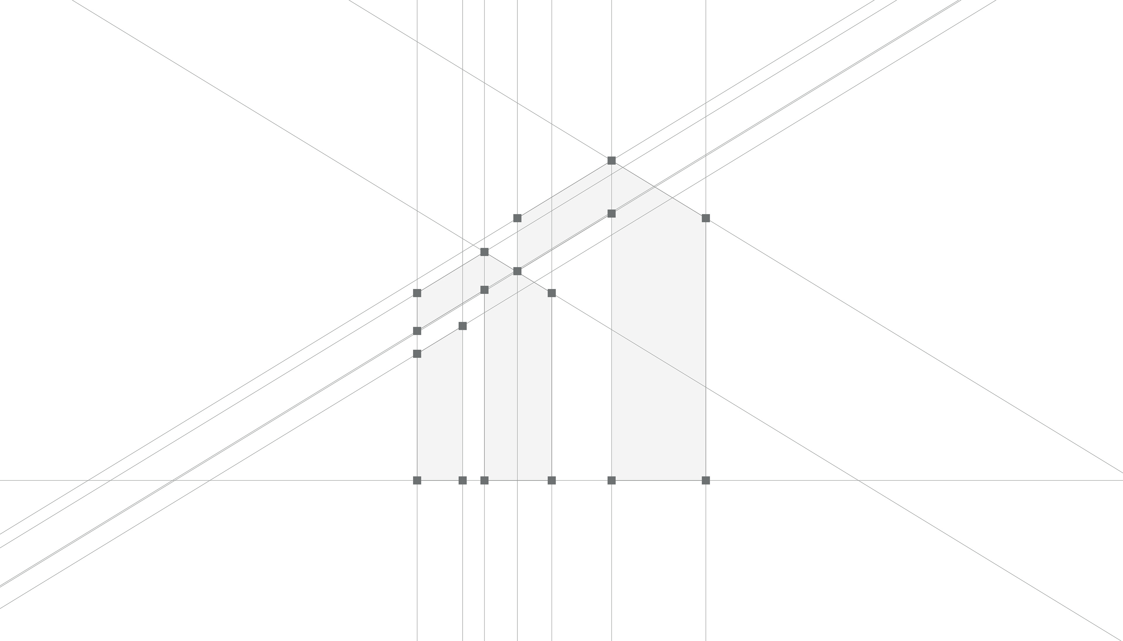
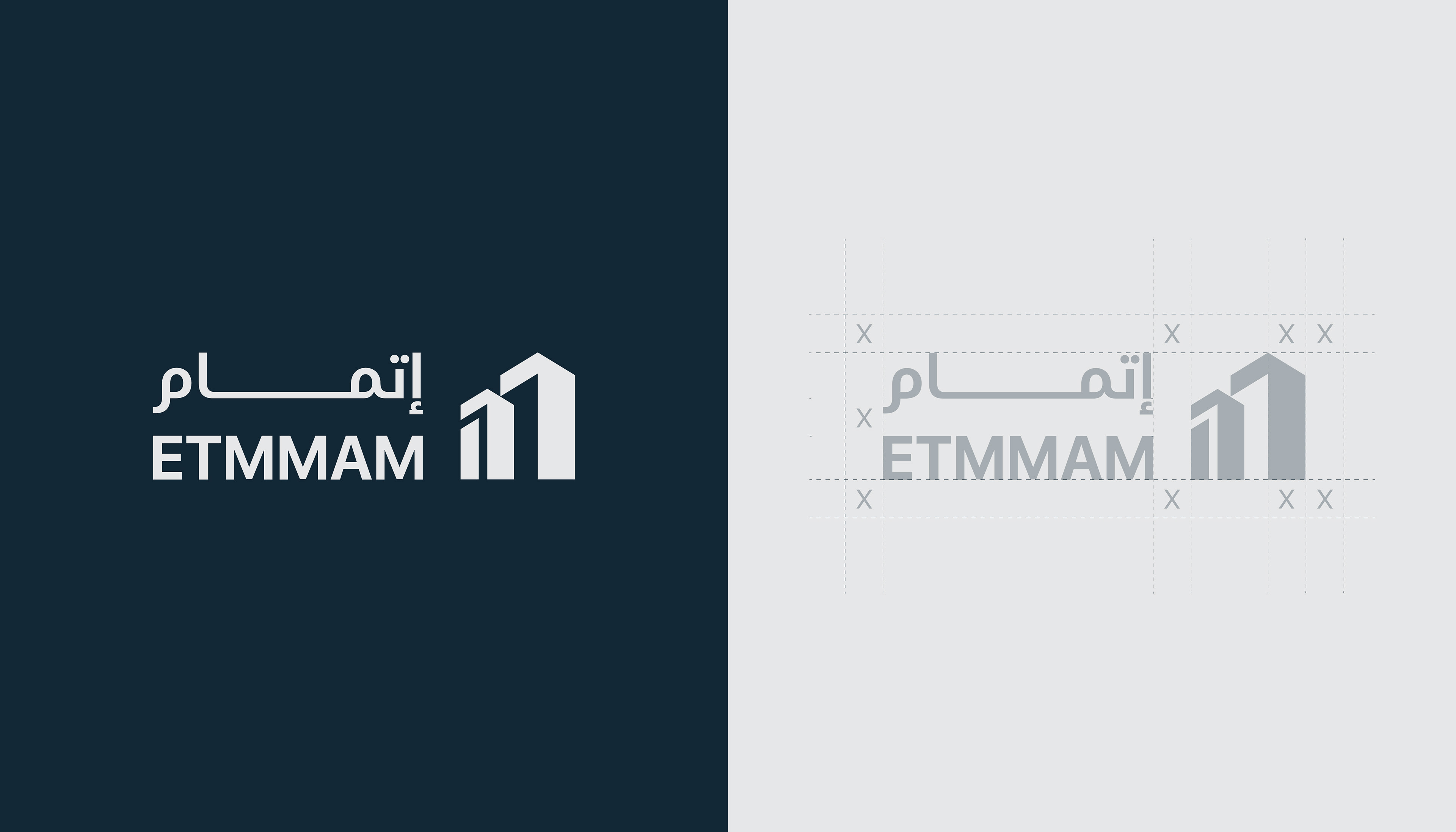
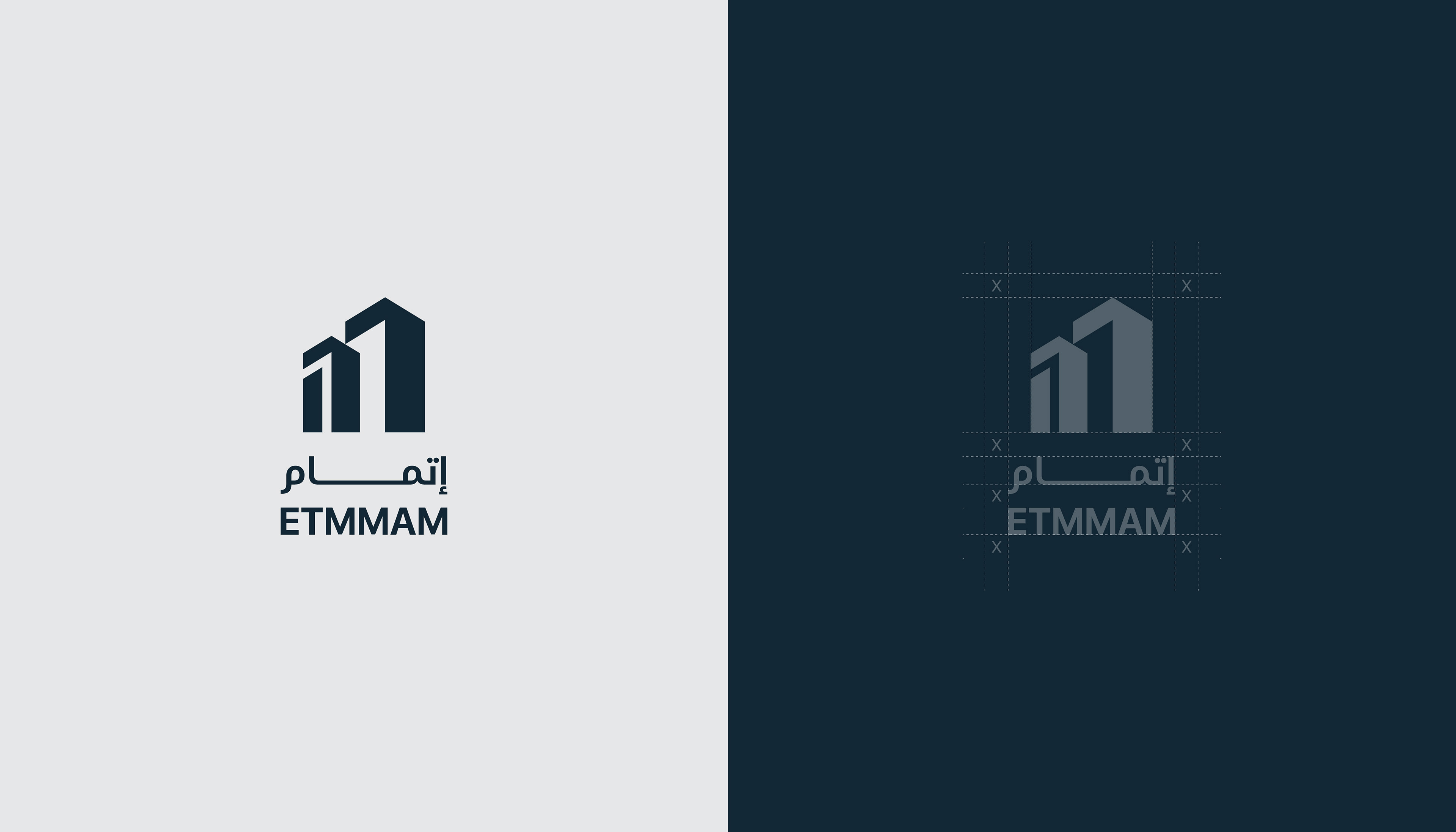
The logo of “Etmmam Contracting” features a smart design that blends simplicity with symbolism. It begins by combining the letter “M” with the shape of a building, eventually forming a modern icon that represents three buildings in ascending size. This progression reflects the journey of construction—from foundation to completion—and symbolizes growth, development, and continuous achievement.
The design uses clean geometric lines that convey precision and strength, both essential qualities in the construction industry. The choice of a grey tone on a dark background enhances the sense of trust and professionalism, making the logo clearly reflect the company’s identity and its mission to deliver fully integrated, well-executed building solutions.
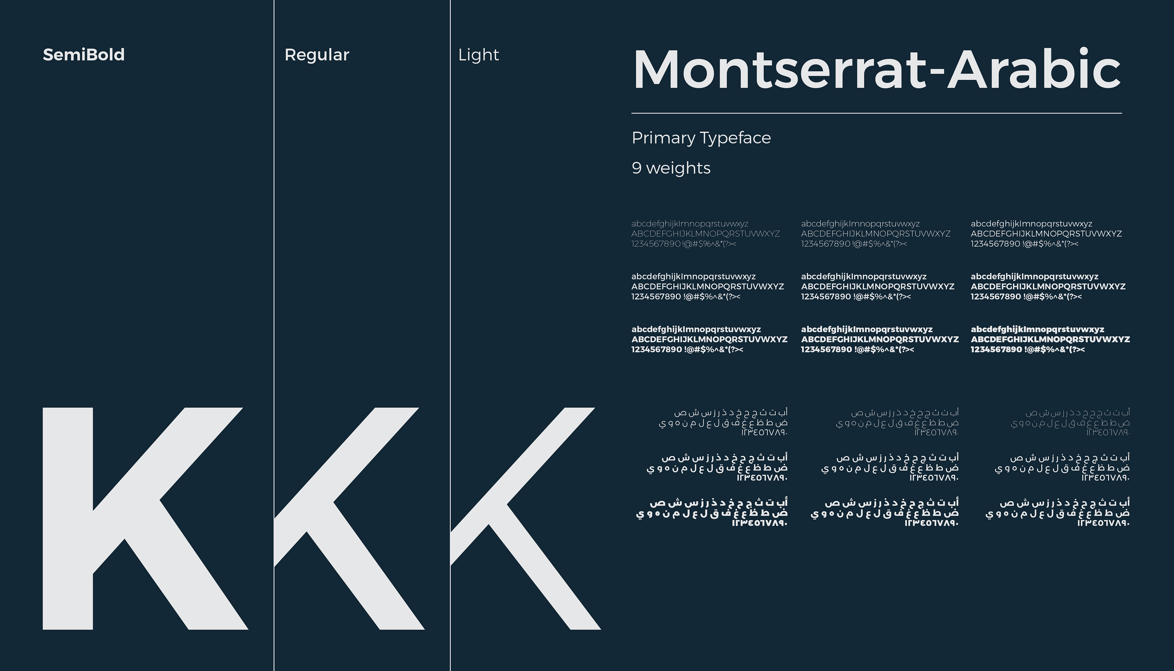
Typeface: Montserrat Arabic
The primary typeface used in the Etmmam brand identity is Montserrat Arabic. It’s a modern and highly legible font that blends Latin and Arabic scripts in a harmonious way.
It comes in 9 different weights, offering great flexibility across applications—whether it’s bold headlines or long-form content—while maintaining a consistent visual identity.
Its clean letterforms and precise angles reflect professionalism and structure, aligning perfectly with the nature of the construction industry where precision and clarity are essential.