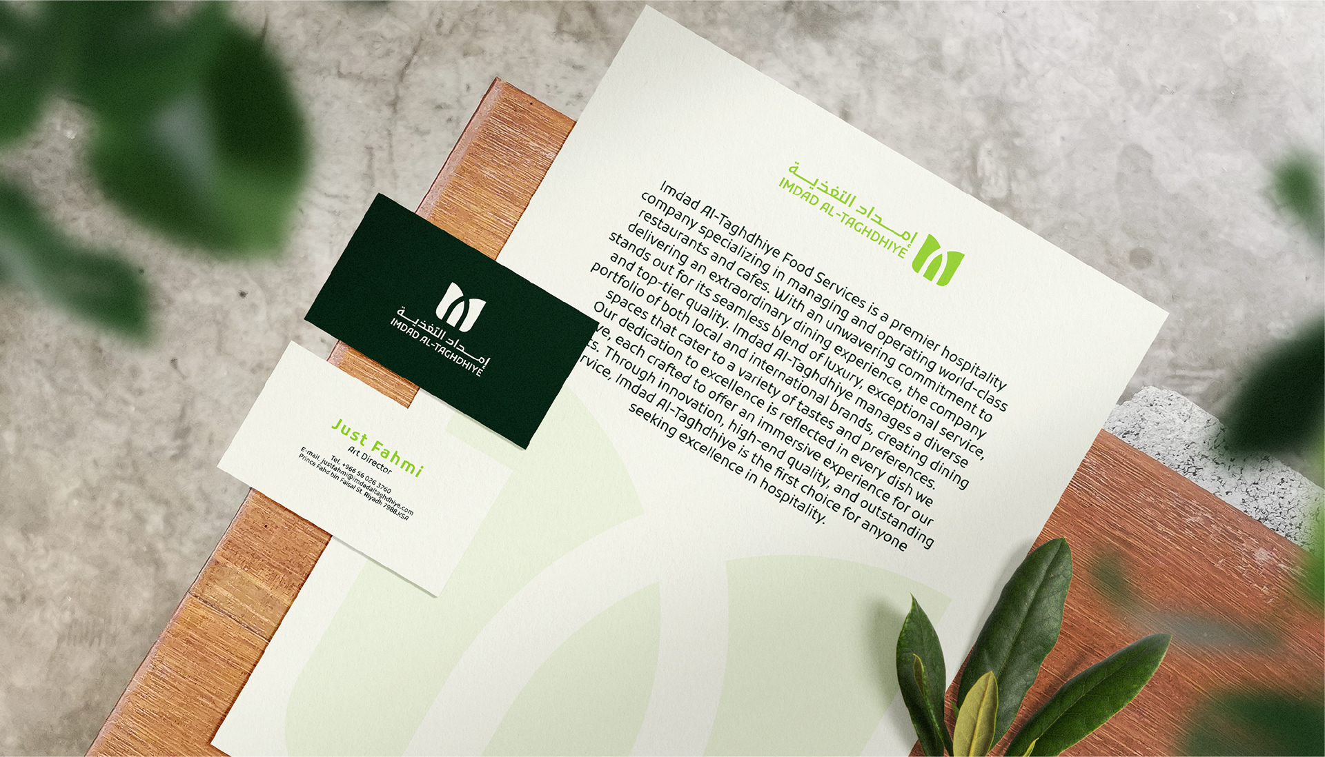
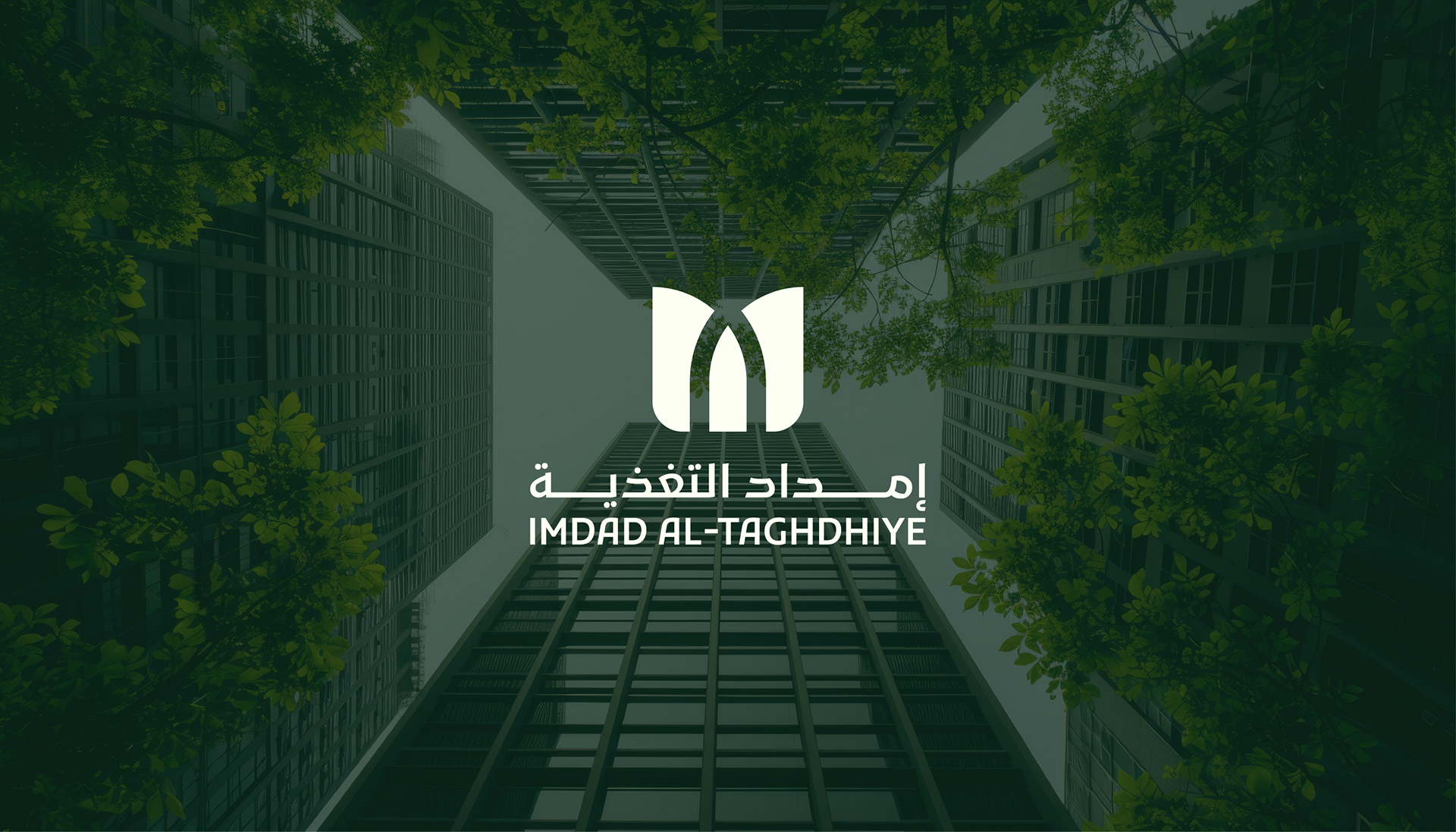
Logo Redesign Concept – IMDAD AL-TAGHDHIYE
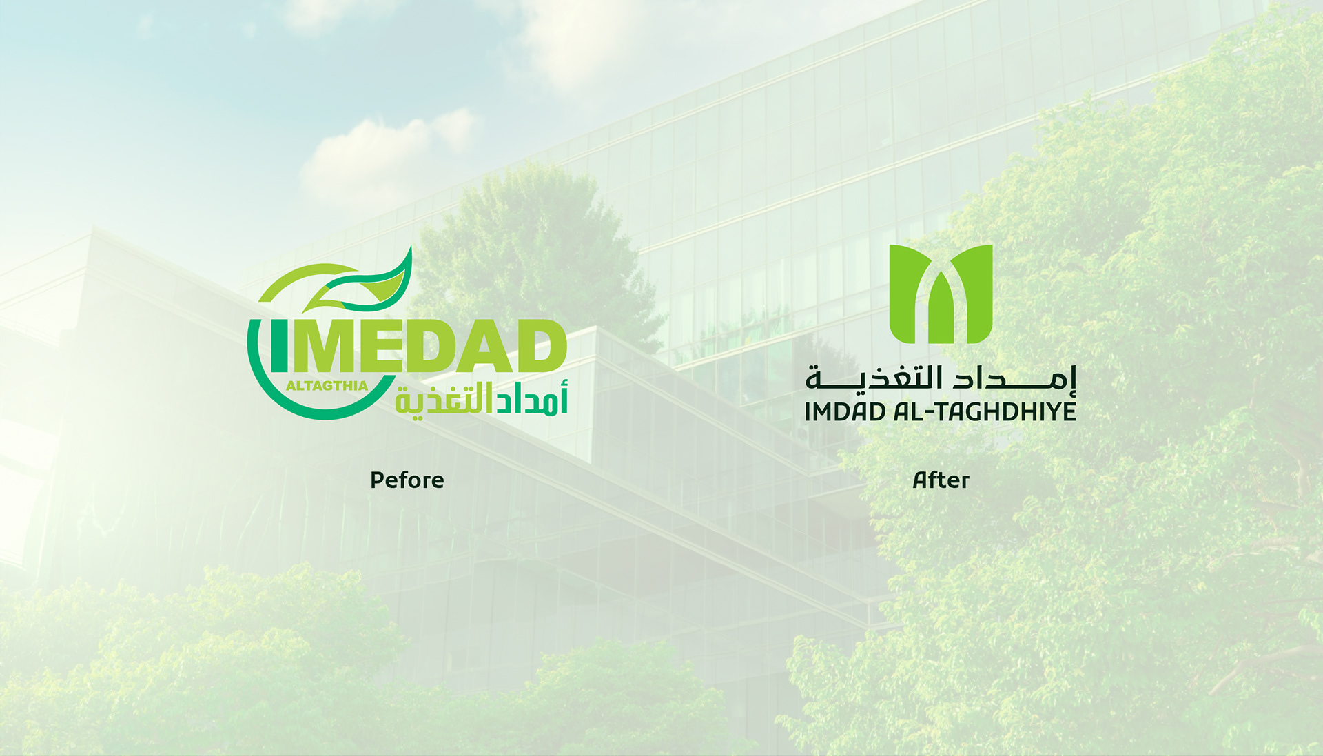
Old Logo – Before:
The previous logo aimed to represent the concept of nutrition through direct elements like leaves and a wheat spike. However, it lacked visual balance, suffered from complexity in typography and color usage, and the overall branding felt limited to food-related businesses — not reflecting the broader role of a holding company with diversified sectors.
New Logo – After:
The redesigned logo marks a significant transformation in the brand’s identity:
✅ Contemporary, minimalist, and versatile
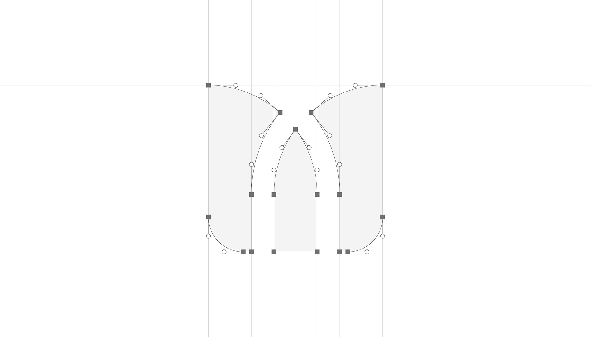
✅ Inspired by the wheat spike — reinterpreted through a clean, geometric structure
✅ The icon subtly forms the letter M — referencing “Imdad” — while simultaneously evoking the shape of a growing plant or seedling
✅ A refined green color palette communicates growth, renewal, and credibility
The Core Concept:
“From one seed, many grow.”
As a holding company, IMDAD AL-TAGHDHIYE plants the seed — from which multiple businesses and sectors grow.
The wheat spike in the logo symbolizes origin, nourishment, and continuous expansion.
Design Philosophy:
Minimal but meaningful – every shape and line has intention
Corporate yet human – combining a professional tone with a natural, approachable form
Scalable & timeless – suitable across digital, print, architecture, and all brand assets
Visual Impact:
The previous logo was visually crowded and inconsistent
The new identity is clean, flexible, and built for a systematic brand rollout
Balanced Arabic and English typography ensures a modern bilingual presence
Strong enough to stand alone, yet adaptable for sub-brands and future divisions
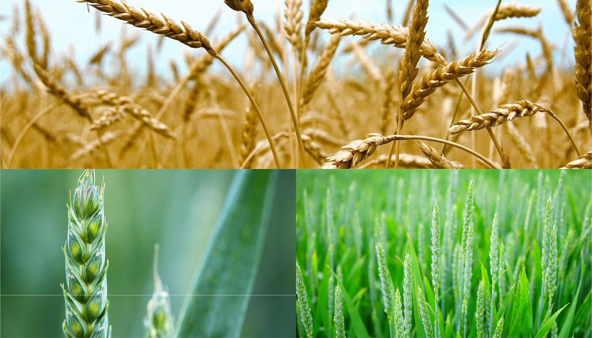
Moodboard Inspiration
The visual reference was deeply rooted in the life cycle of wheat — from green sprouts to golden harvest. These images inspired both the form and color palette of the new identity.
✅ The green shades seen in the early stages of wheat growth were translated into a fresh, modern green tone in the logo — reflecting vitality, growth, and sustainability.
✅ The structured formation of the wheat spikes inspired the geometry of the brand mark — creating a shape that evokes both a wheat grain and the letter “M” from “Imdad”.
✅ The progression from green to golden hues reflects the company’s journey from nourishment to maturity, reinforcing its role as a holding entity that nurtures and grows its subsidiaries.
“This brand isn’t just built on color and form — it’s rooted in life itself.”
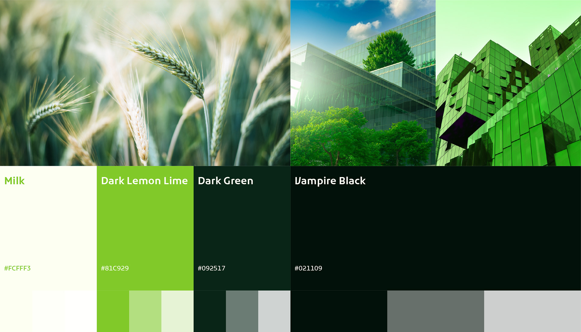
Color Story – IMDAD AL-TAGHDHIYE
1. Milk (#FCFFF3)
A soft, delicate shade reminiscent of early morning light during harvest.
It represents purity, calmness, and fresh beginnings, ideal for clean backgrounds and visual breathing space.
2. Dark Lemon Lime (#81C929)
This vibrant green captures the energy of sprouting crops.
It symbolizes youth, vitality, and fast growth.
Perfect as a standout accent or a primary brand color in interactive designs.
3. Dark Green (#092517)
A deep, grounding tone—like fertile soil or firm roots.
It communicates stability, depth, and trust.
Useful for dark-themed layouts or content-heavy elements that require visual focus.
4. Vampire Black (#021109)
An ultra-dark shade with a strong, modern presence.
It brings a sense of authority, professionalism, and mystery, especially in corporate or executive-level applications.
Why These Colors Work Together
They reflect the entire wheat journey—from seed, to growth, to harvest.
They balance agricultural heritage with a modern corporate identity.
The palette is flexible for sub-brands and different sectors under the holding company.
It visually expresses the harmony between nature (green tones) and strategic business thinking (dark + neutral tones).