
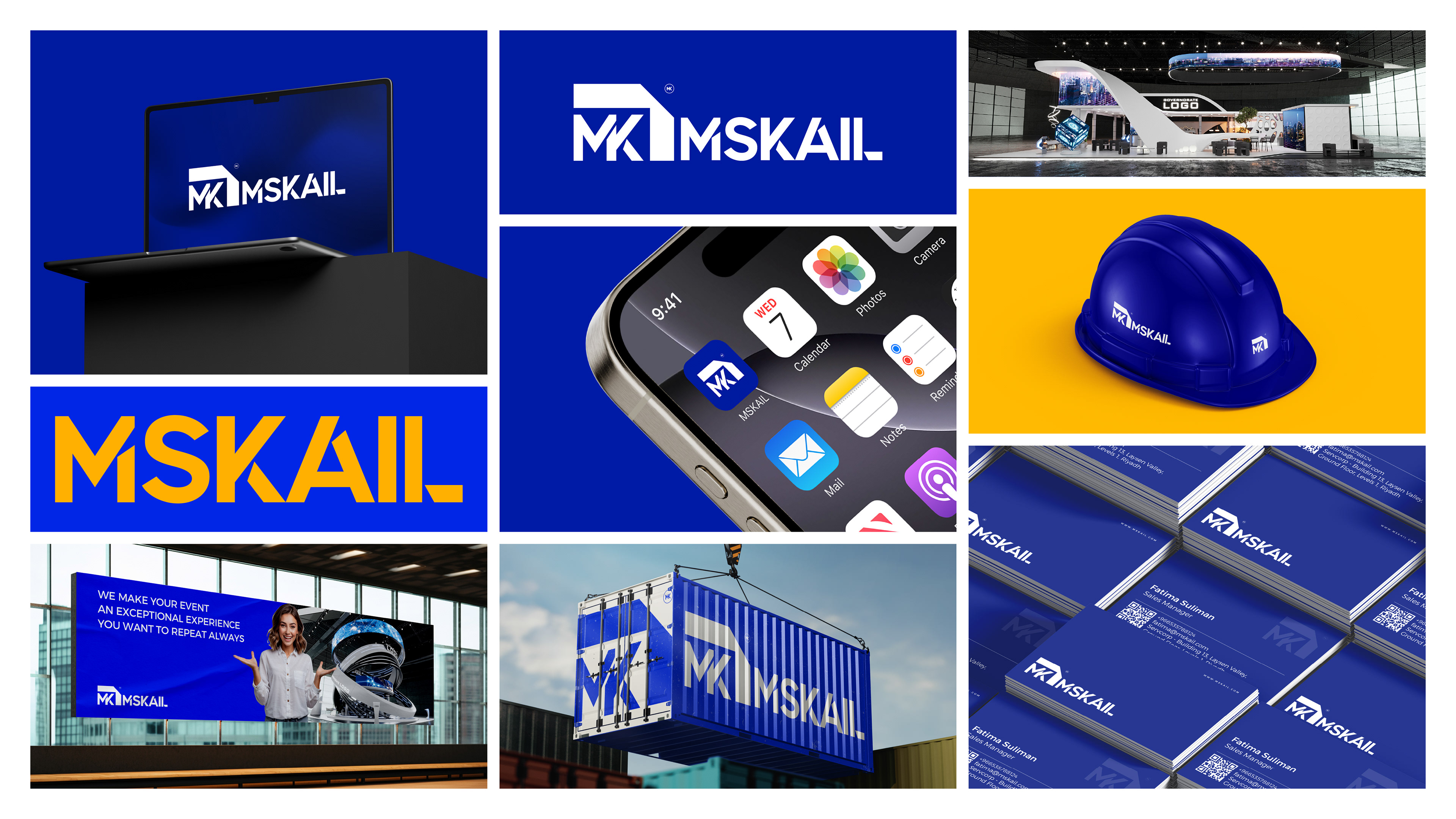
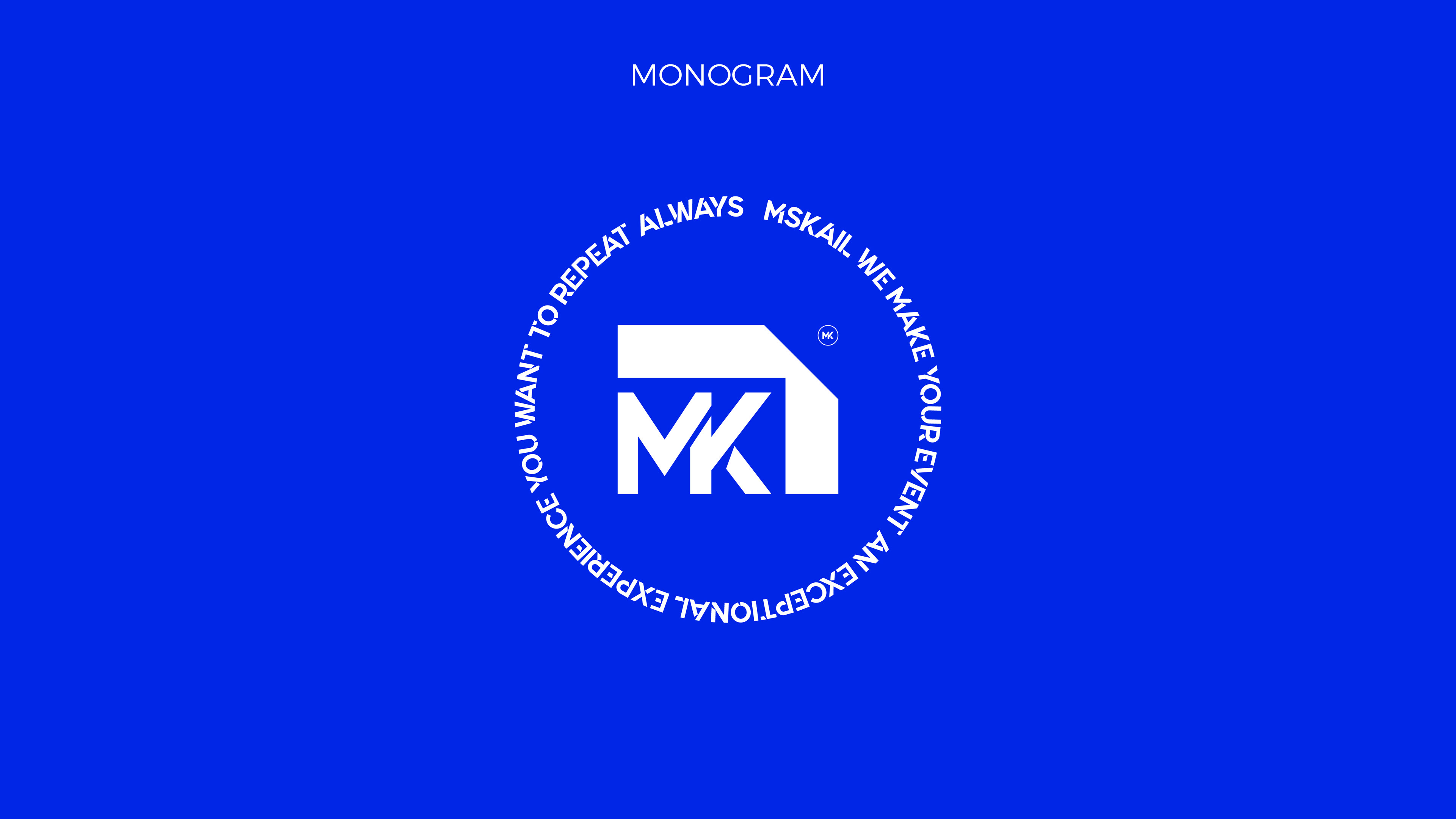
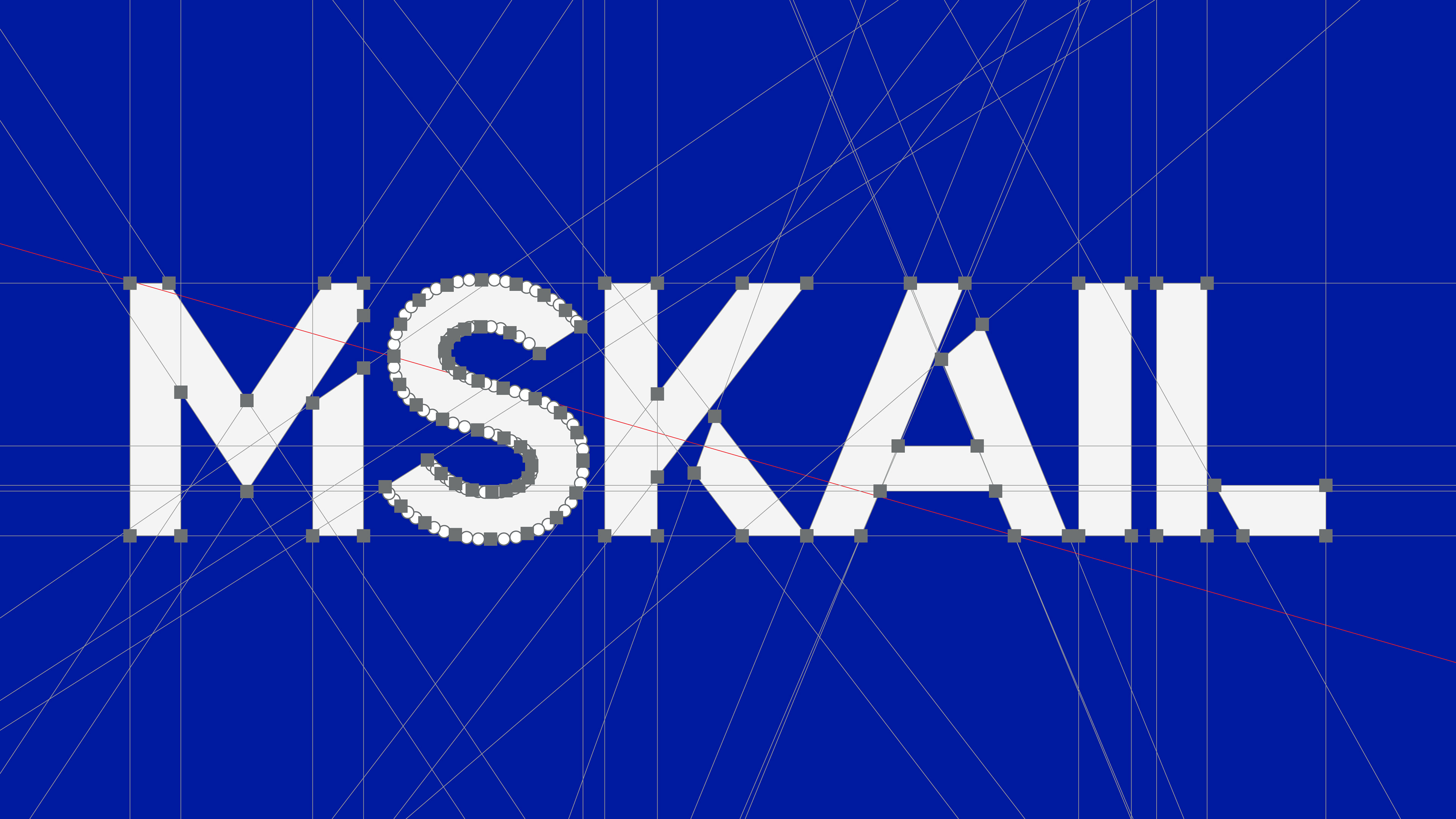
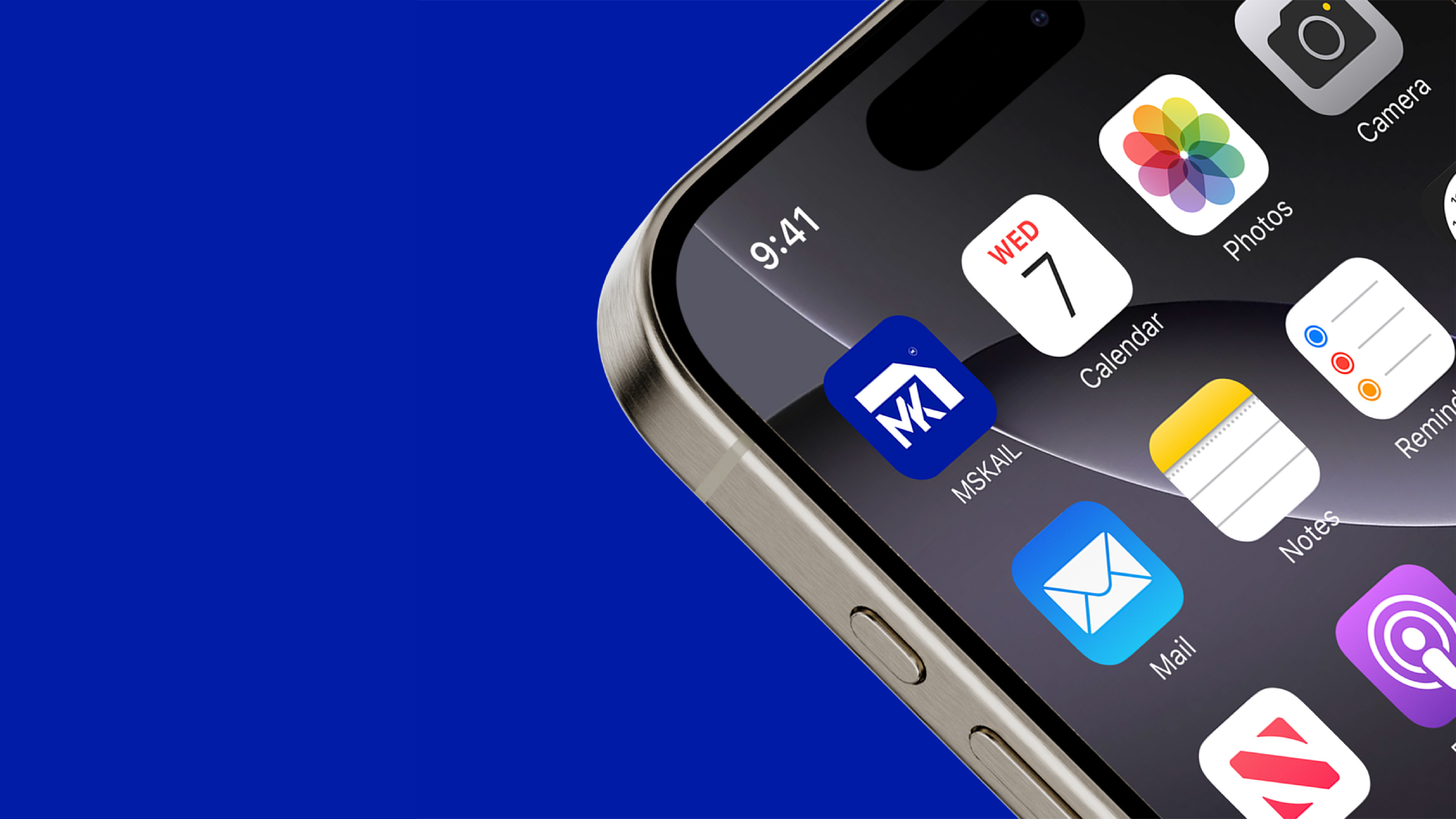
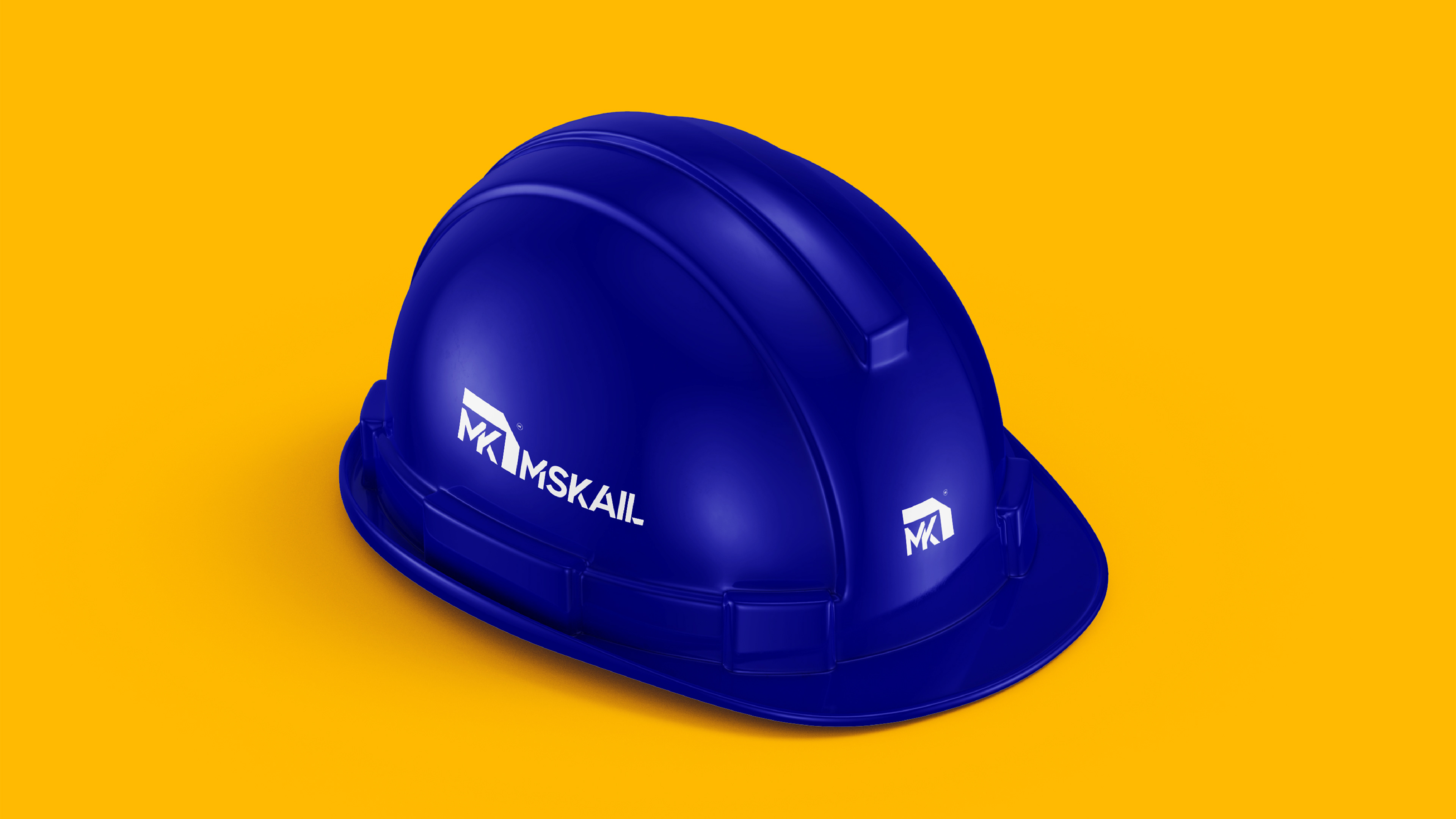
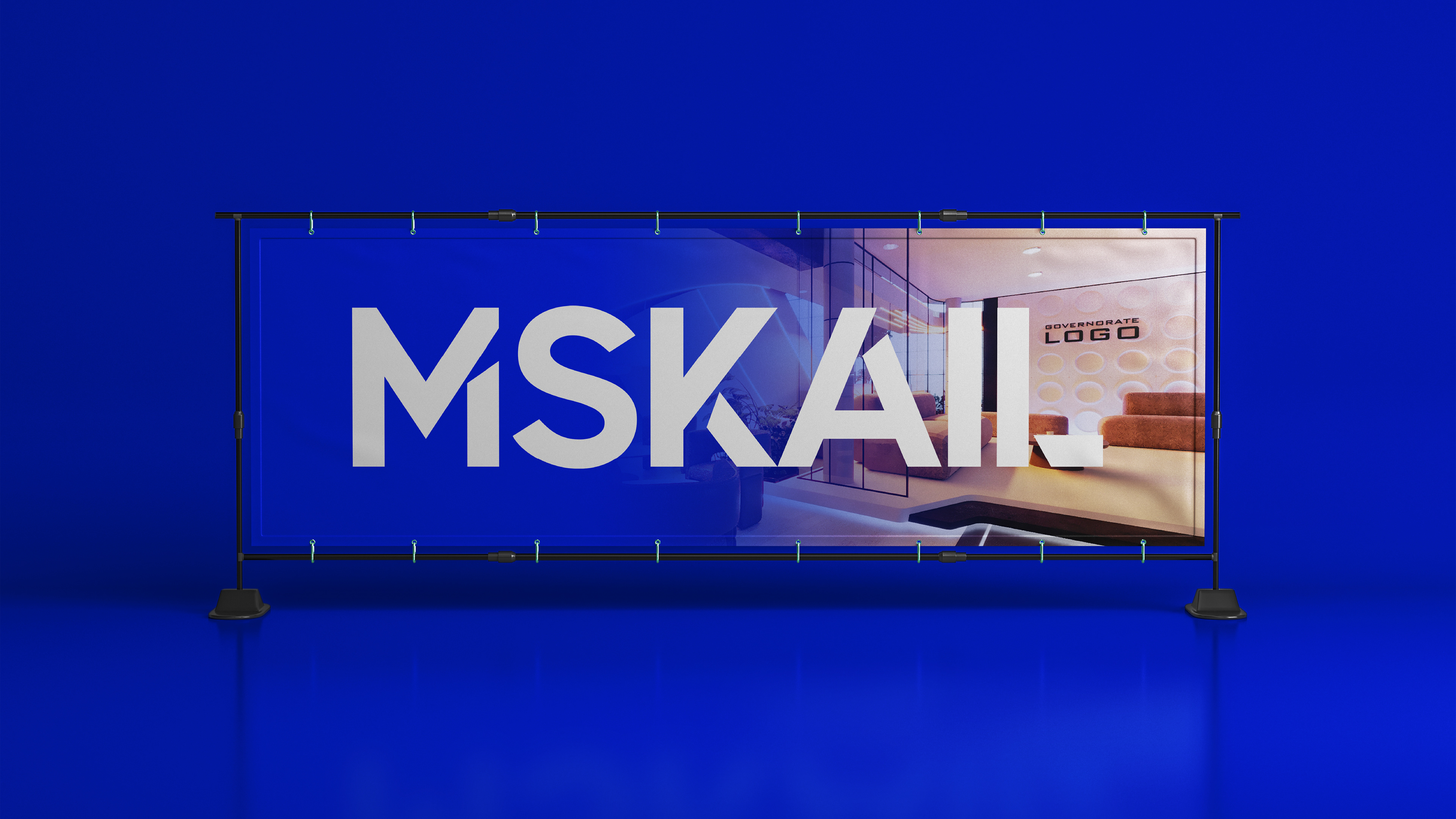
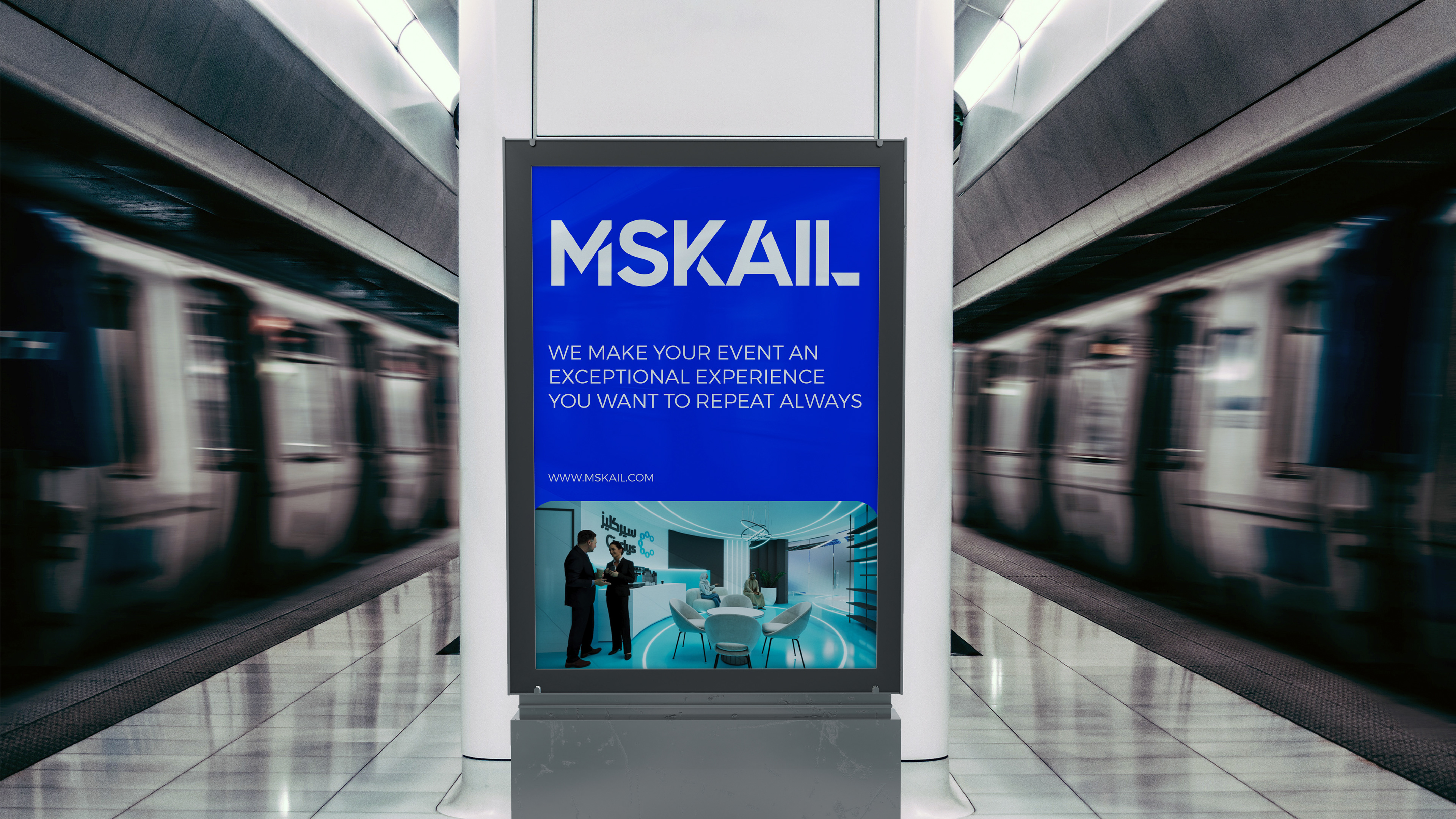
MSKAIL
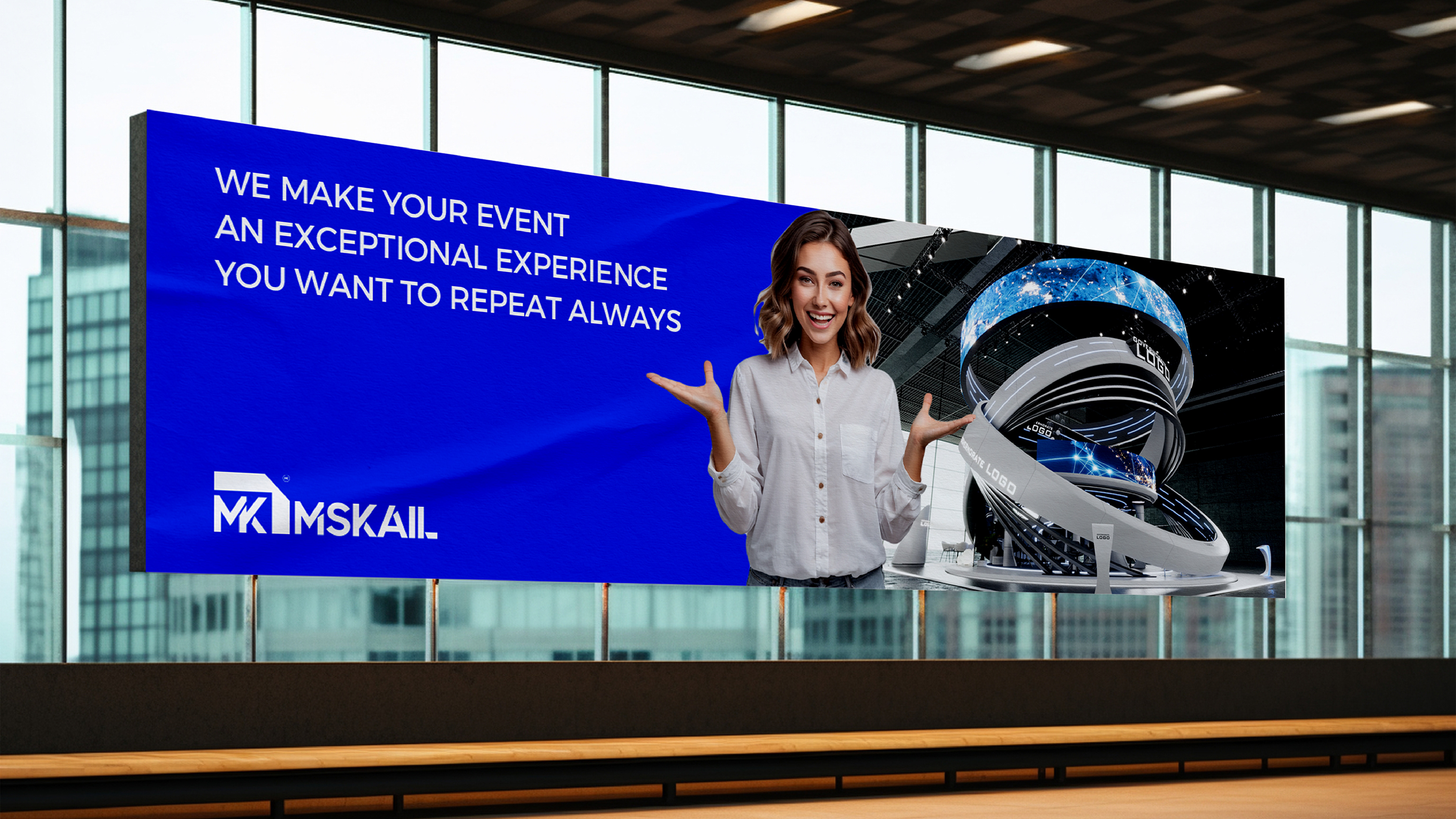
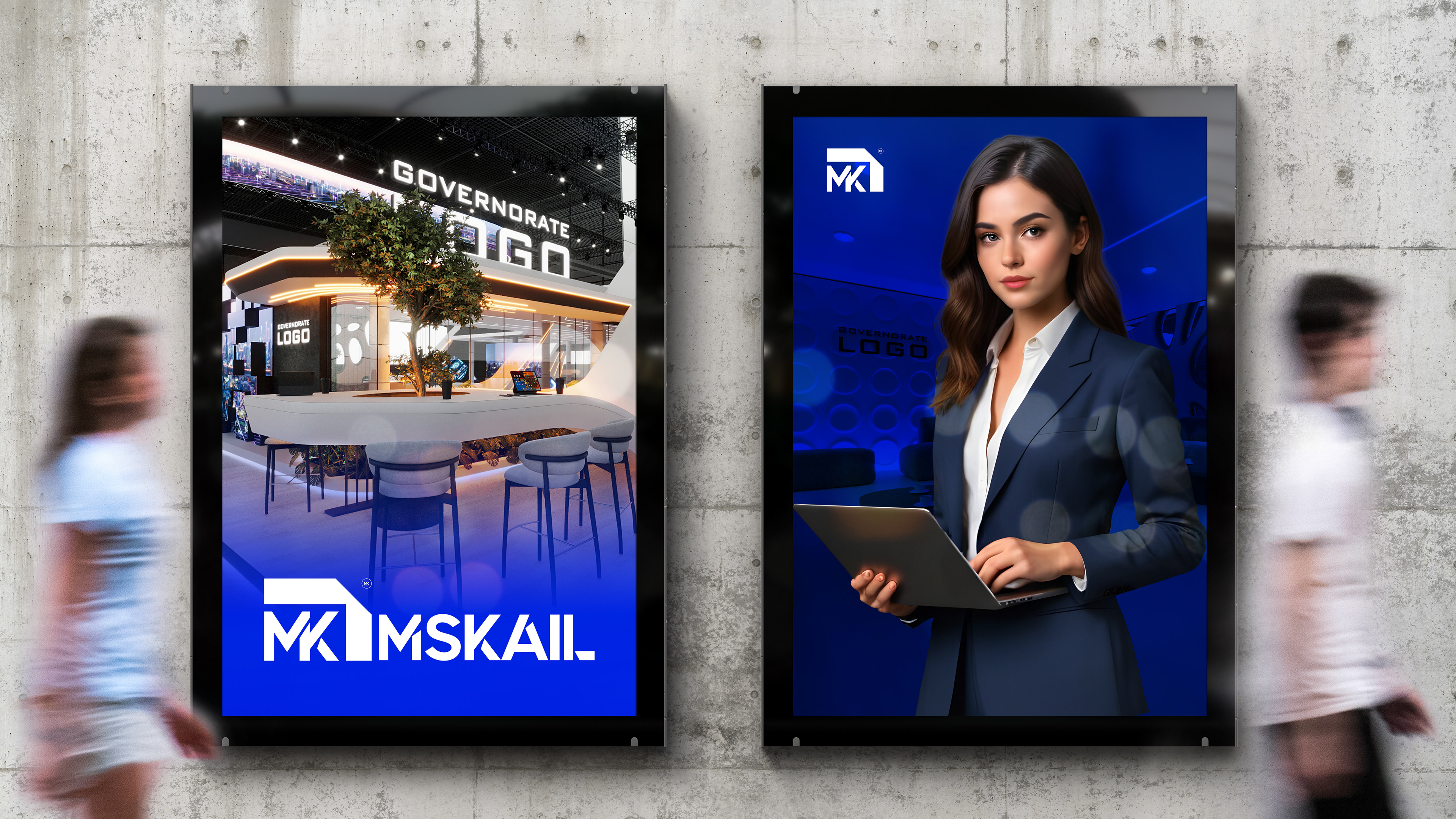
a leading company in the field of exhibition and conference organization, booth design and implementation, and event management. We take pride in being an innovative and exceptional company, with a team of highly skilled workers and employees who possess over 20 years of experience from various countries around the world.
Our state-of-the-art factory, spanning over 4000 square meters, is equipped with the latest designs and technologies, allowing us to provide unparalleled services that have never been seen before in the Middle East. We strive to create unforgettable experiences for our clients, aiming to deliver the highest levels of quality and creativity in all the events we organize.
Our Vision
To be the leading and reference company in the field of exhibition and event organization, and to be a source of inspiration and creativity for our clients.
Our Mission
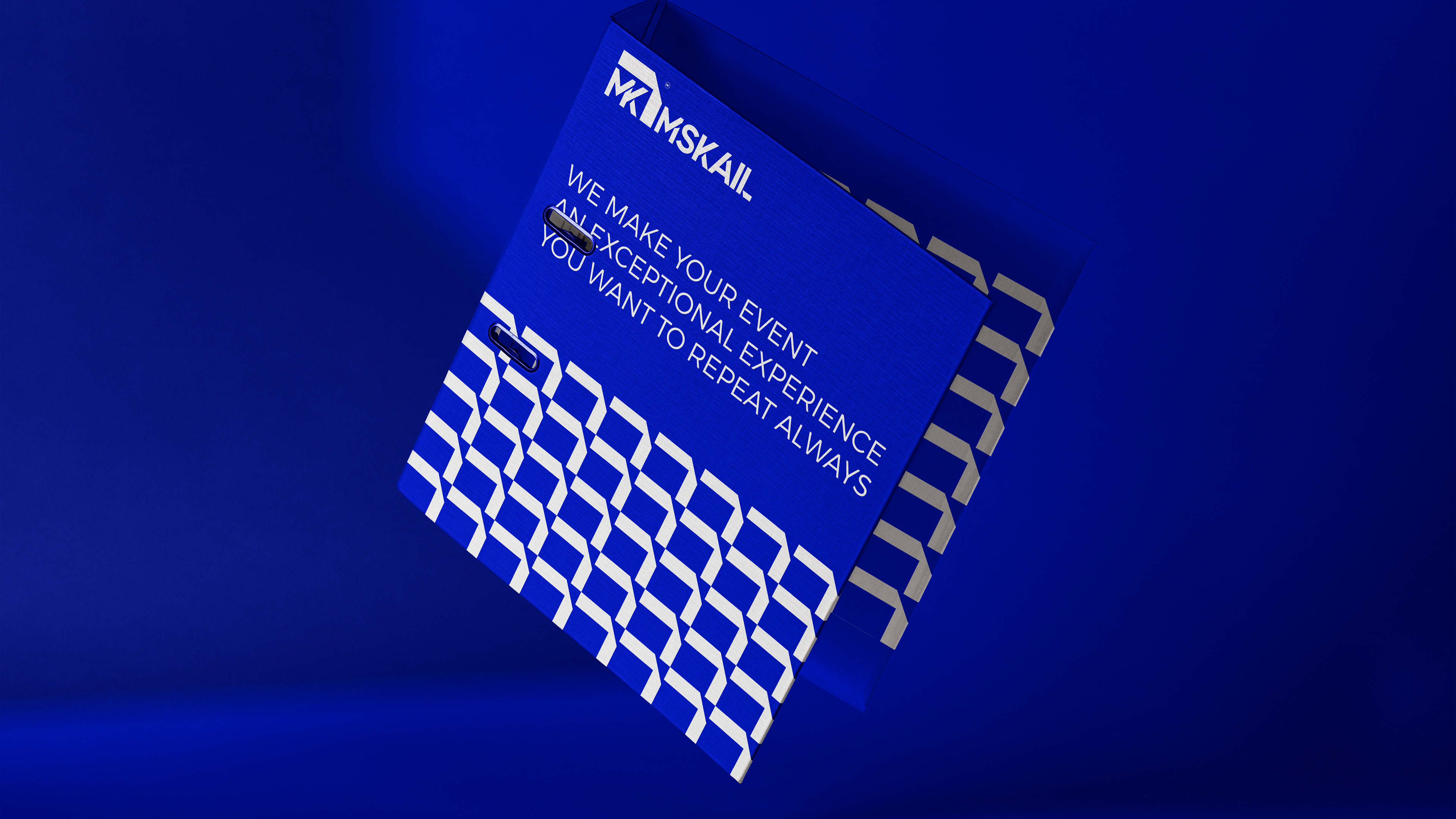
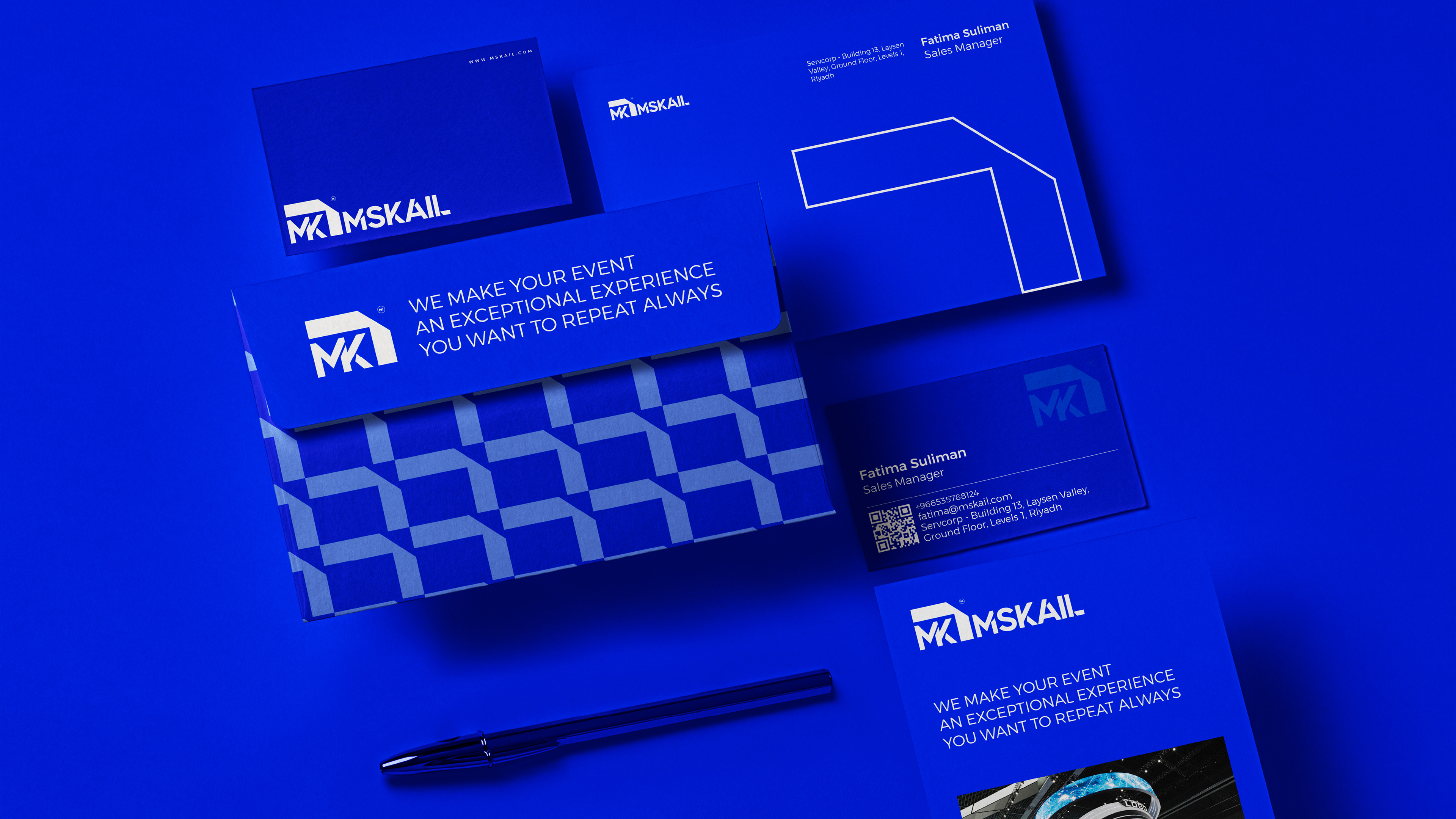
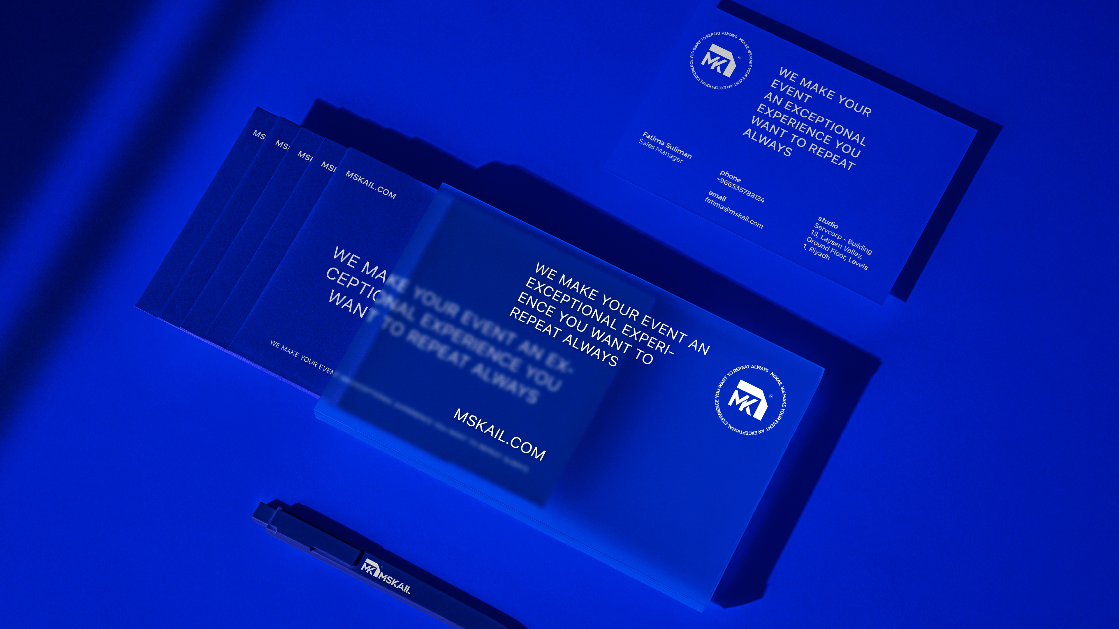
At Mskail, we understand the significance of events and exhibitions in creating opportunities for companies to thrive. We are determined to provide our clients with outstanding experiences in their event participation. We take on the difficult tasks and make their participation a remarkable journey that serves and fulfills their objectives.
Our Goal
Delivering high-quality and innovative exhibition and event organization services.
Achieving customer satisfaction and exceeding their expectations by meeting their needs and goals.
Providing an ideal and conducive environment for participation in events, fostering communication and knowledge exchange among companies and participants.
Enhancing fruitful collaboration with our clients, local and international partners.
Achieving sustainable success and growth in the exhibition and event organization industry.
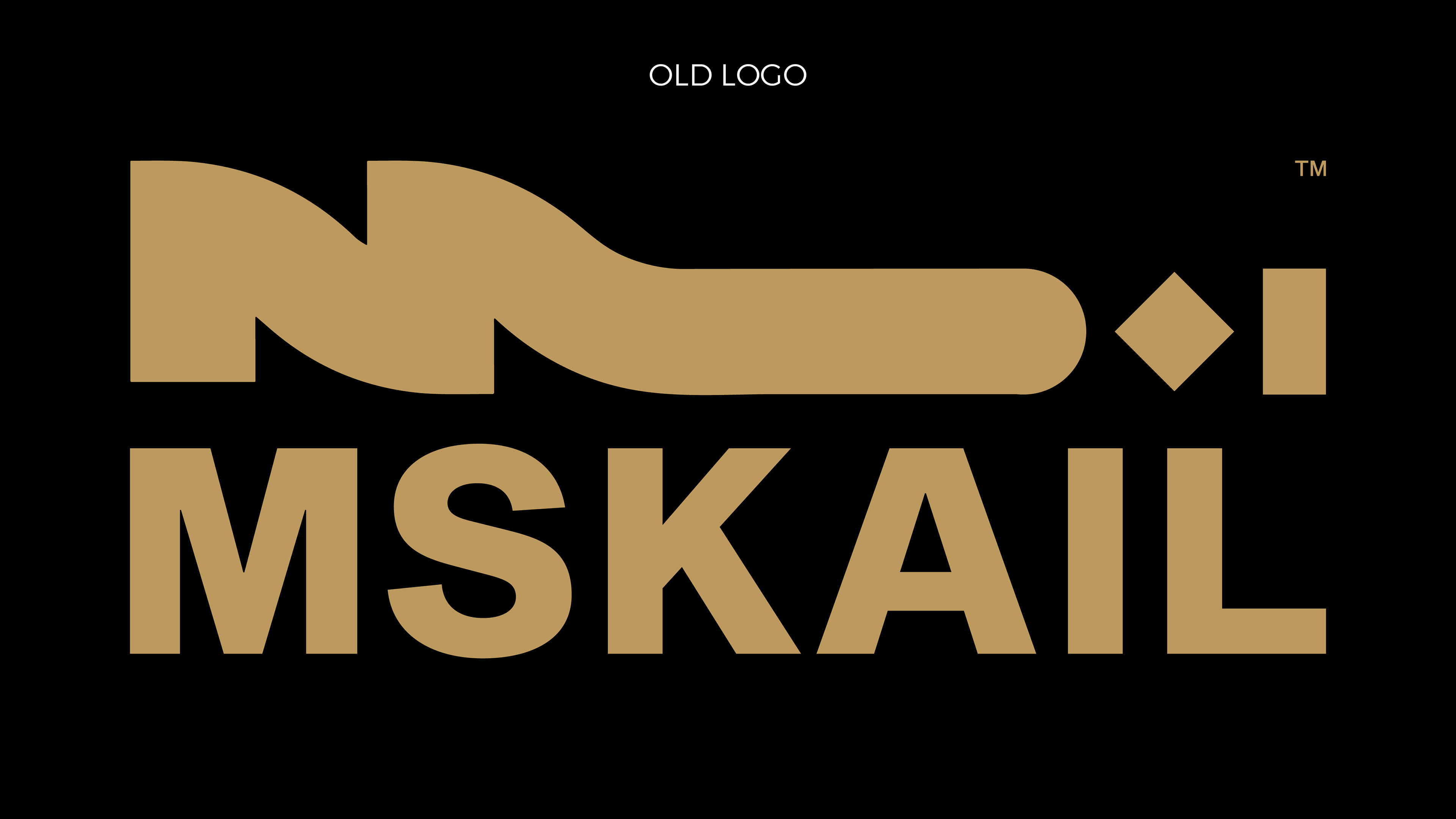
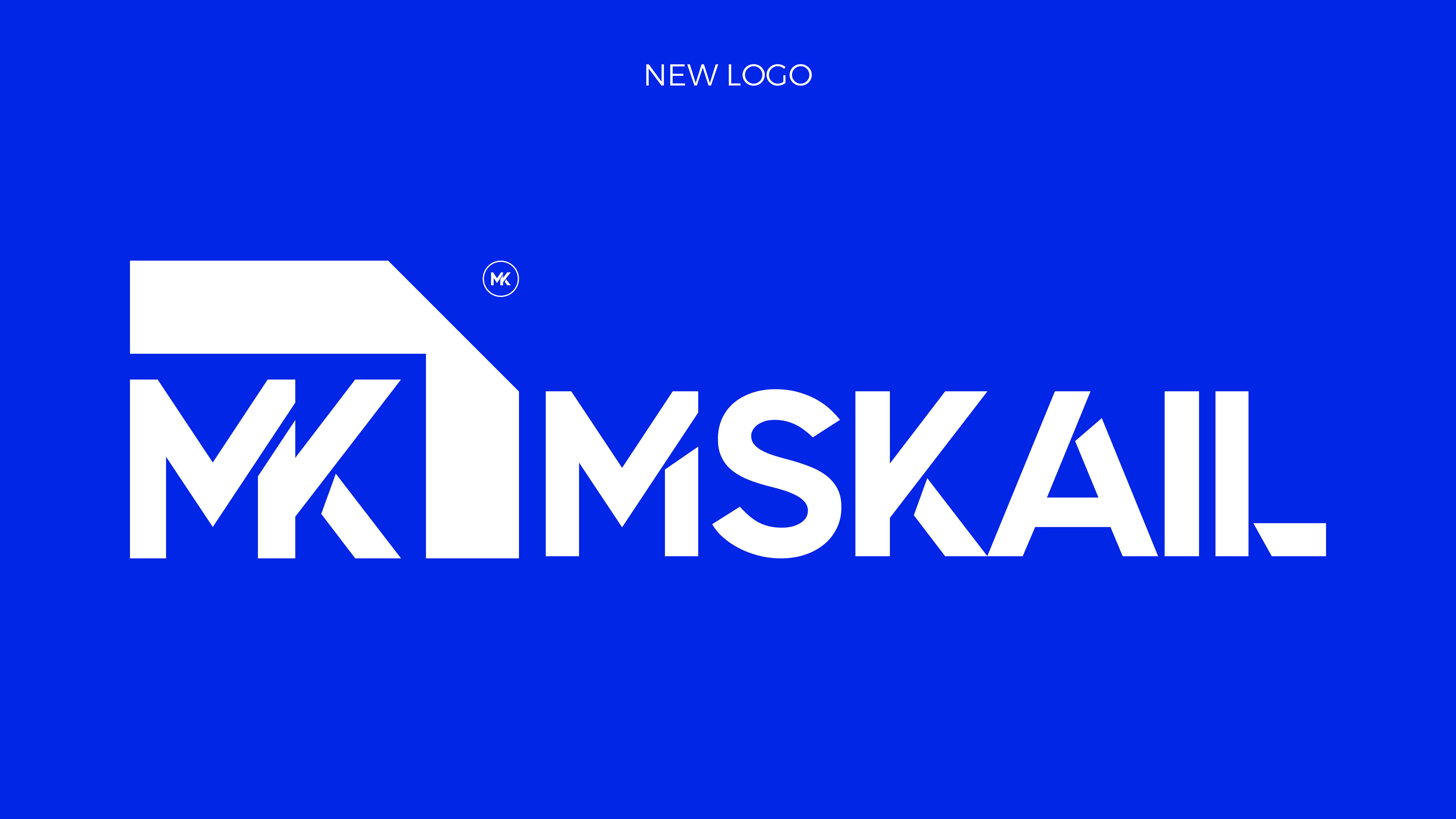
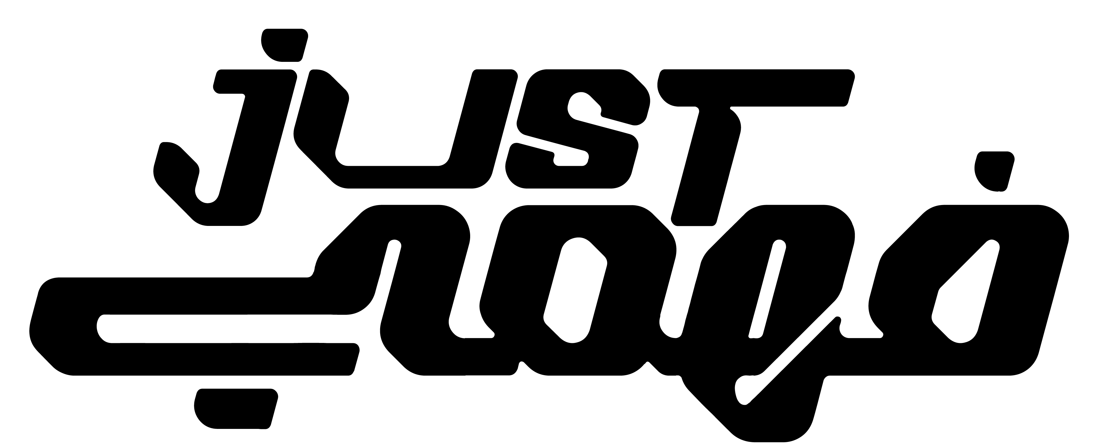
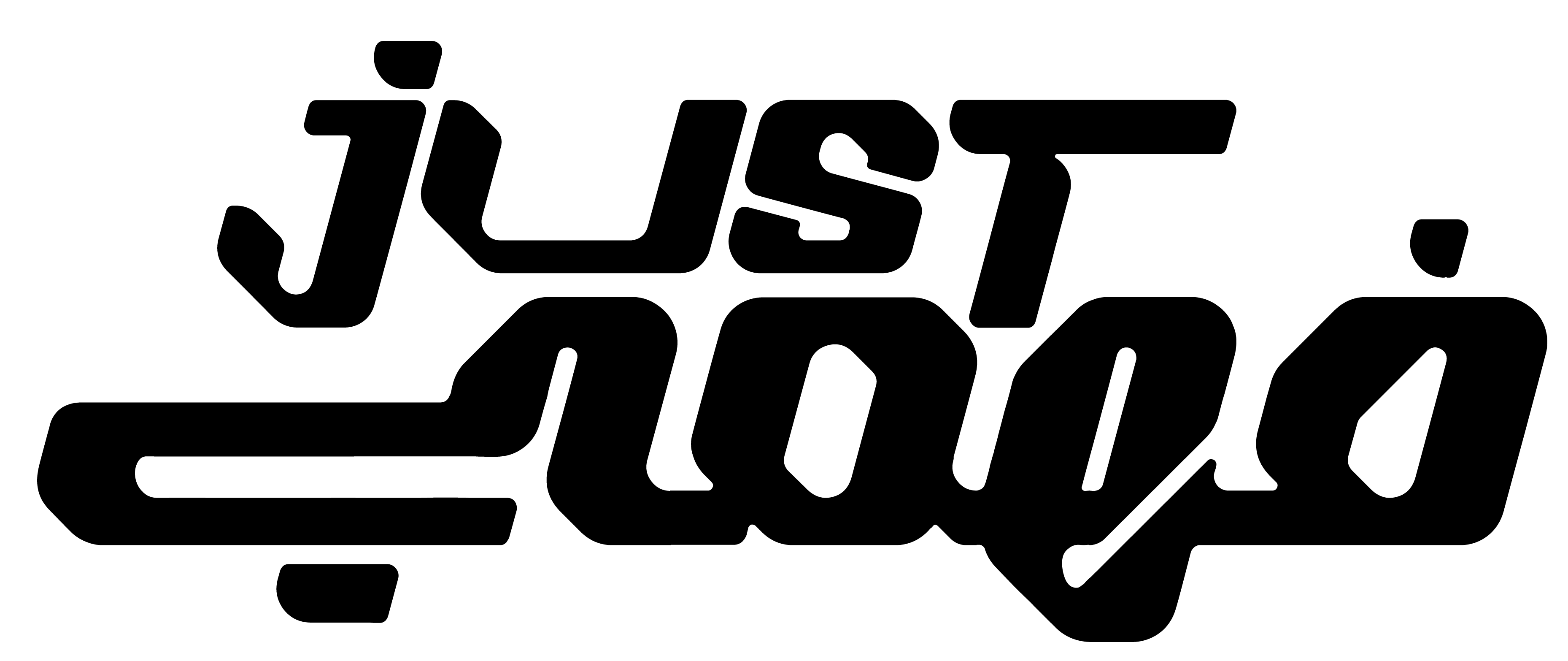
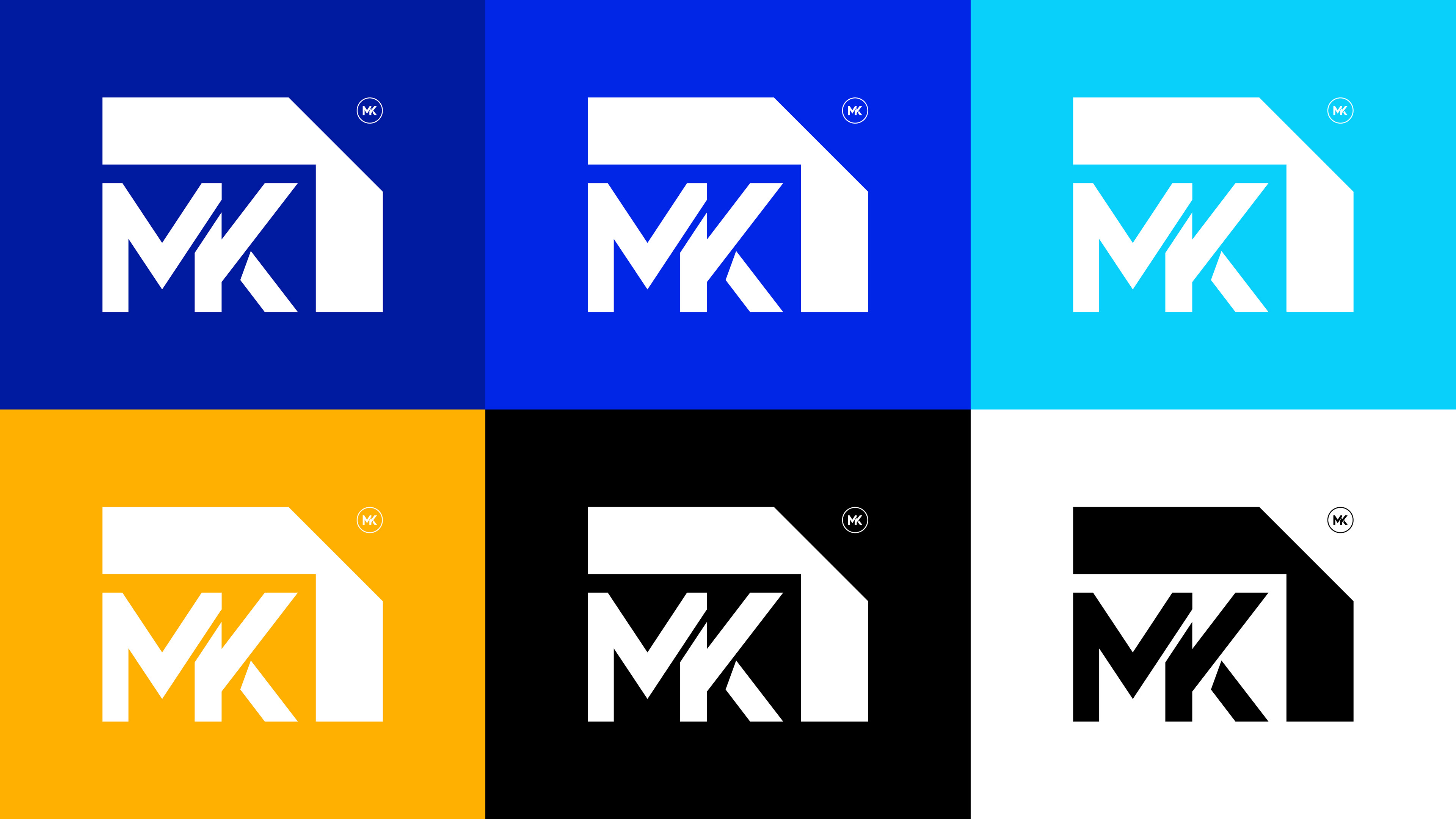
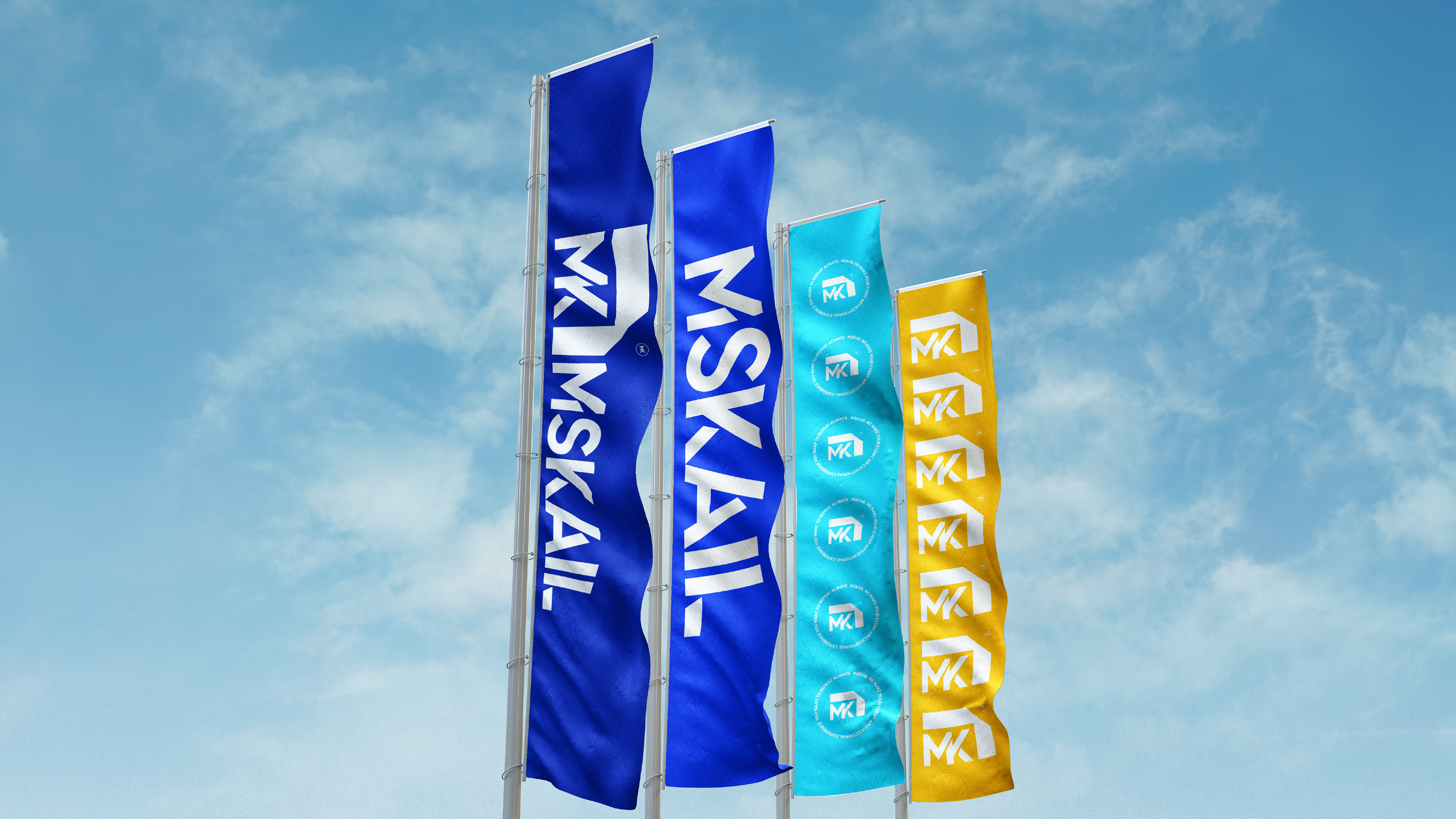
The rebranding process from the yellow to the white logo includes significant changes that enhance the brand's position in the field of booth design and exhibition and conference supplies.
1. Colors:
- The new white color conveys professionalism, simplicity, and purity, creating a sense of cleanliness and openness, which helps highlight the brand's unique services without distractions.
- The previous golden yellow color gave a sense of luxury and strength, reflecting values of authenticity and stability. However, switching to white could be an attempt to present the brand in a more modern and minimalist way.
- The previous golden yellow color gave a sense of luxury and strength, reflecting values of authenticity and stability. However, switching to white could be an attempt to present the brand in a more modern and minimalist way.
2. Design and Icons:
- The white logo features a sharp, geometric design in the "M" and "K" letters, giving an impression of strength and precision, which are essential qualities in booth production that requires high standards and durability.
- The yellow logo had smoother lines, providing a softer look that communicated creativity and flexibility, which might have been more suitable if the brand focused on creative designs.
3. Visual Message of the Brand:
- This update supports the brand in conveying a message of professionalism and a focus on quality and precision in its products. It shows that the brand might be aiming to be more modern and innovative, catering to a market that leans towards clean and contemporary designs.
- This approach makes the brand more appealing to clients looking for professional booth designs that reflect both luxury and simplicity, thus increasing customer trust in their products and services.
The transition from the yellow to the white logo reflects a new brand strategy, bringing it closer to the concept of efficiency and specialization. This is crucial for any company working in the field of exhibition and conference setup.

LOGO CONCEPT
M stands for Marketing : Marketing is the main element in organizing exhibitions and conferences, as companies need to promote themselves and their products in an effective way.
K stands for Knowledge : Knowledge, which indicates the importance of information and experience in organizing events and providing successful experiences.
As for the design, the upper part of the logo, which appears as a square with two missing sides, represents perfection and excellence in work, which the company adds through its services. The missing sides indicate the opportunity for creativity and integration that the company seeks to achieve with customers.
This composition gives the impression that the company does not only provide traditional solutions, but also adds added value and creative thinking that helps complete the customer experience.
Logo lettering concept
M - Marketing
Attracting audiences and participants.
Attracting audiences and participants.
S - Strategy
Careful planning to execute the exhibition successfully.
Careful planning to execute the exhibition successfully.
K - Knowledge
Knowledge of the industry and target audience.
Knowledge of the industry and target audience.
A - Audience
Understanding visitor needs and expectations.
Understanding visitor needs and expectations.
I - Innovation
Introducing new ideas to attract attention.
Introducing new ideas to attract attention.
L - Logistics
Supply management, transportation and operational arrangements.
Supply management, transportation and operational arrangements.
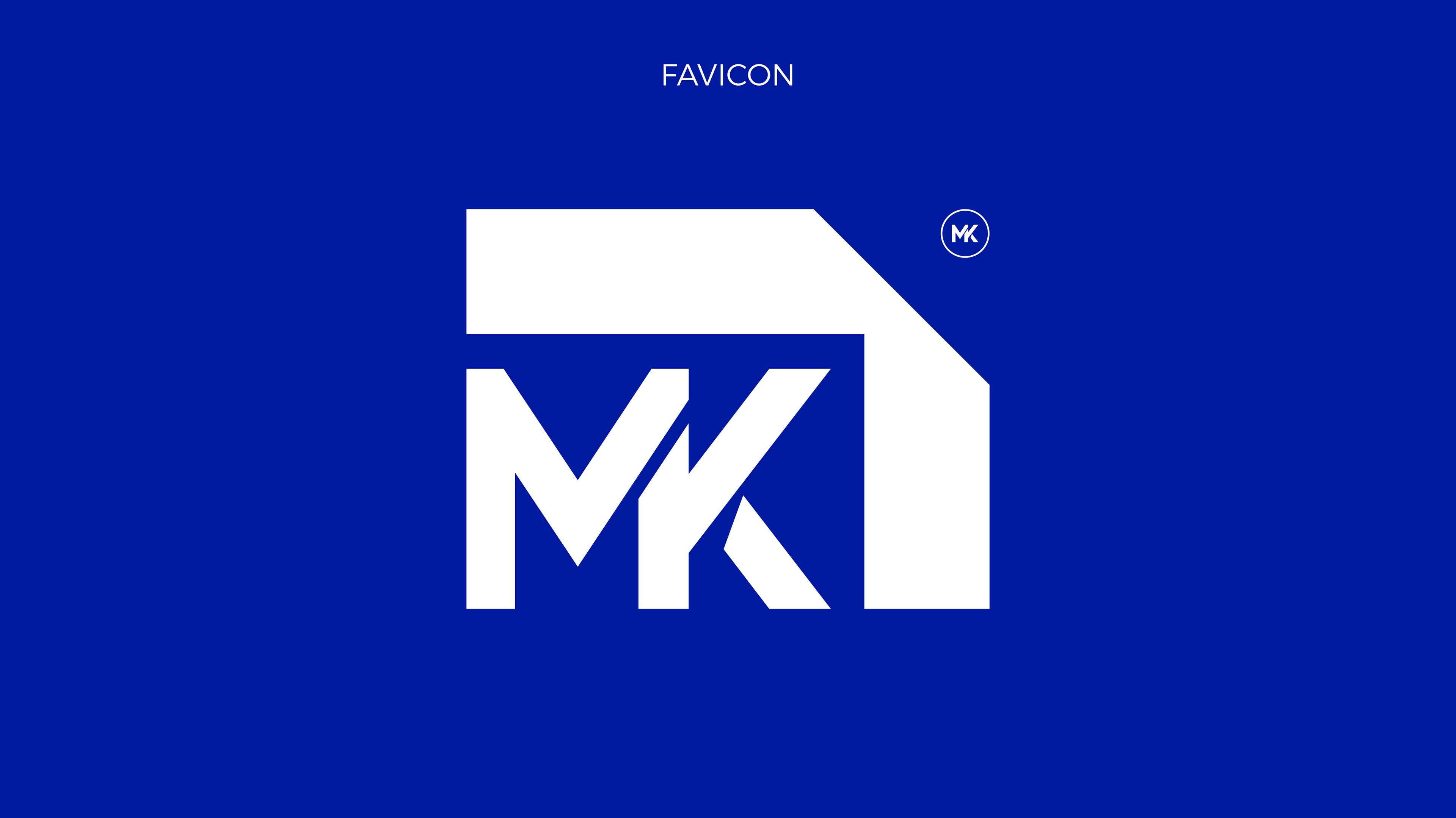
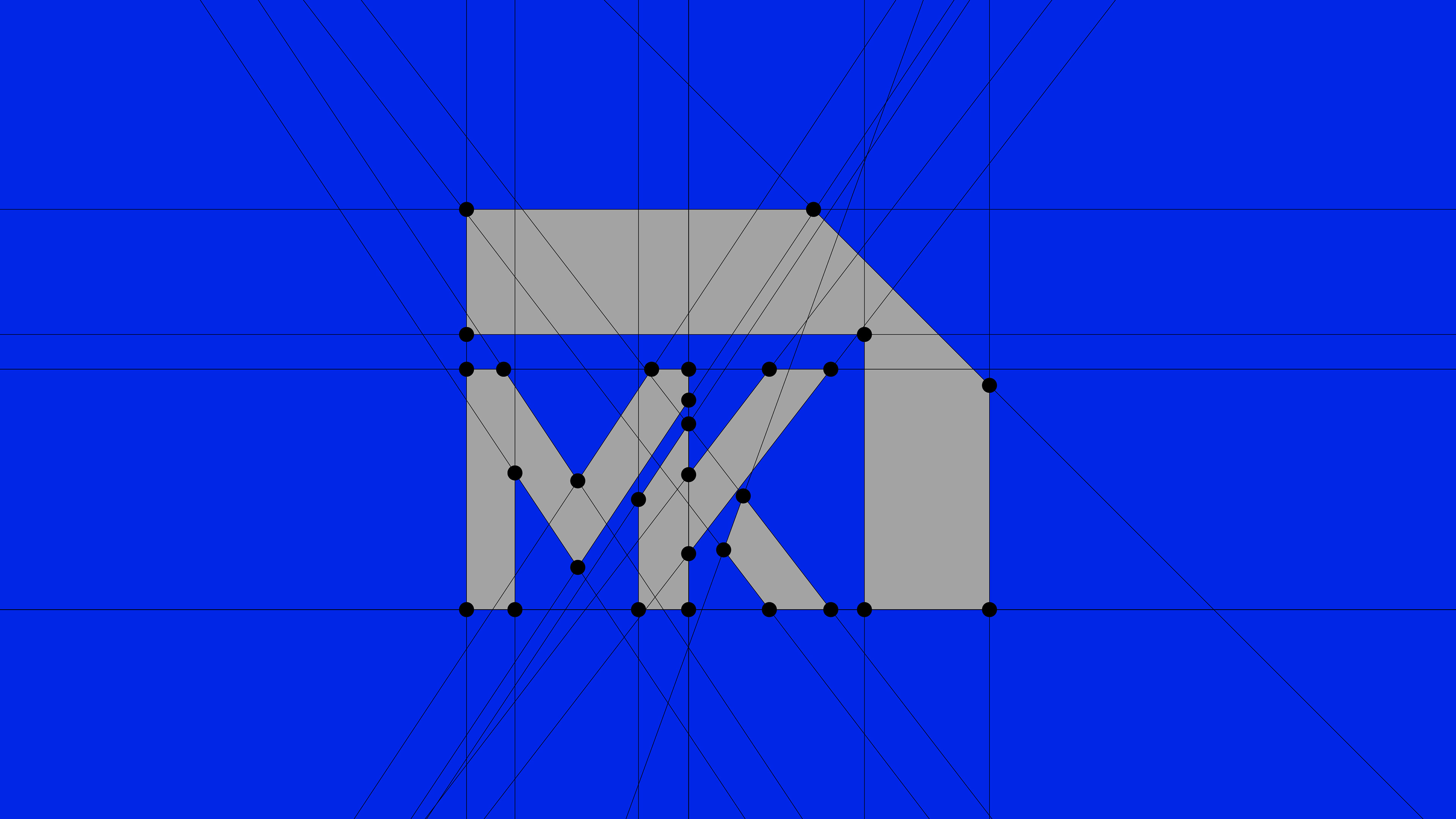
Icon Construction
We chose the icon to be a square missing two sides, which suggests that the square is missing two sides, but in order to complete it, it also needs two sides, which is the client, and what you convey is that its success matters more to me than it does, because without it, the two missing sides will not be completed.
The icon construction for Mskail is based on the principles of modern minimalism and clarity, reflecting the brand's forward-thinking technology. Each icon should be simple, geometric, and easy to understand, avoiding unnecessary detail. Icons must use the approved color palette to maintain consistency with the brand's identity. The design should be scalable, ensuring that icons remain clear and functional at both small and large sizes, making them suitable for digital and print use.
Logo Text structure
The Mskail logo text is constructed using the Quantify typeface, chosen for its modern, geometric, and clean appearance. The text is simple and bold, reflecting the brand's core values of clarity, innovation, and minimalism. The spacing between letters is carefully balanced to ensure readability and maintain a sleek, professional look.
Color philosophy
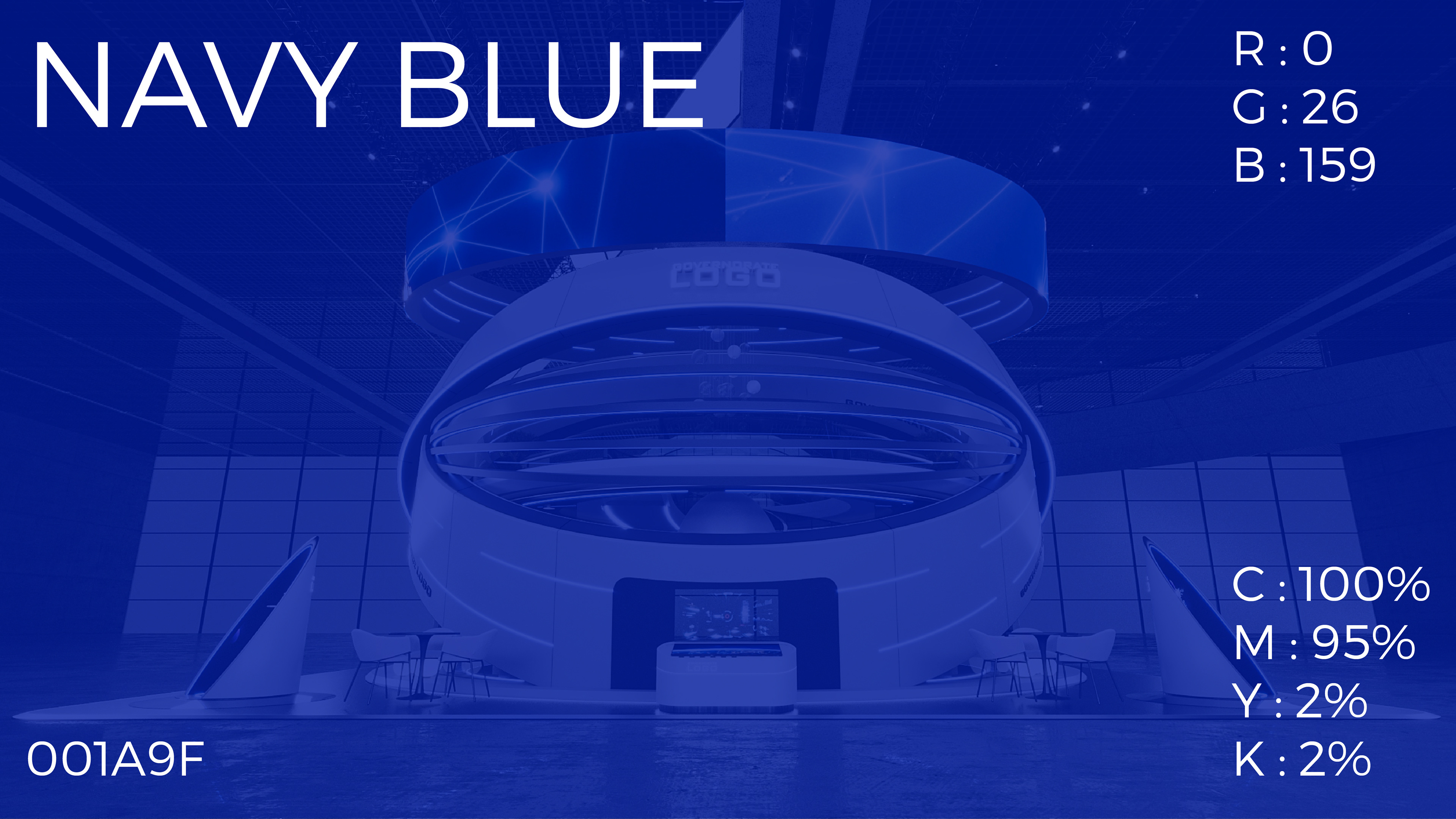
1. 001A9F - Navy Blue
Psychology : Dark blue expresses confidence, strength, and stability. It is often used in sectors that require showing professionalism and credibility, such as large businesses and government institutions.
Usage : This color is ideal as a base or primary color in a company’s identity, especially if you want to give a serious and reliable impression.
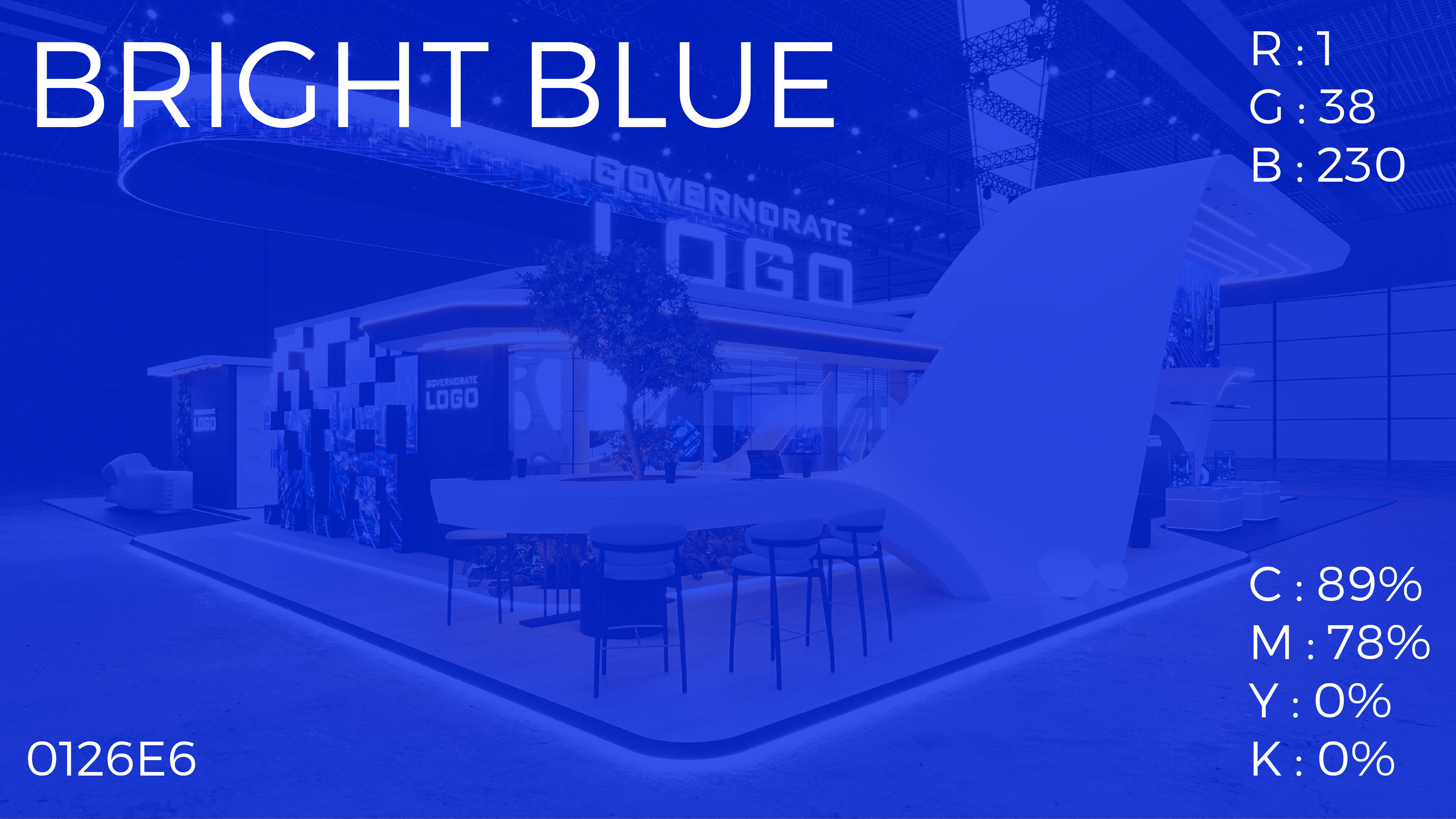
2. 0126E6 - Bright Blue
Psychology : Bright blue expresses creativity, communication, and optimism. It gives a sense of activity and high energy, making it excellent for attracting attention.
Usage : It can be used as a secondary color or to highlight important elements in a design, such as logos or explanatory texts.
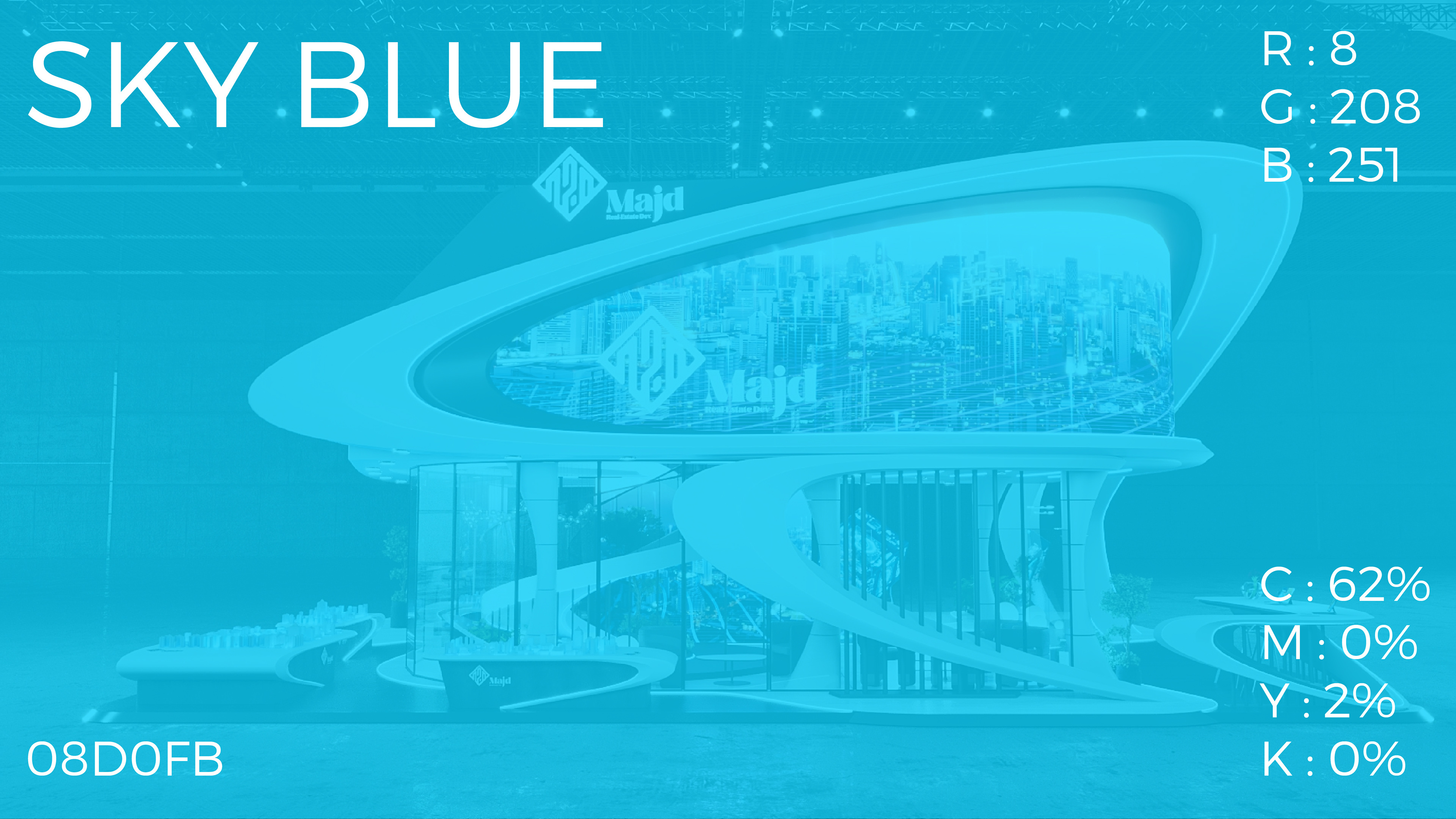
3. 08D0FB - Sky Blue
Psychology : Light blue is associated with calm, serenity, and clarity. It often suggests confidence and peace, and is considered a soothing color for the eyes.
Usage : It can be used to tone down dark colors, providing balance and visual comfort in a design.
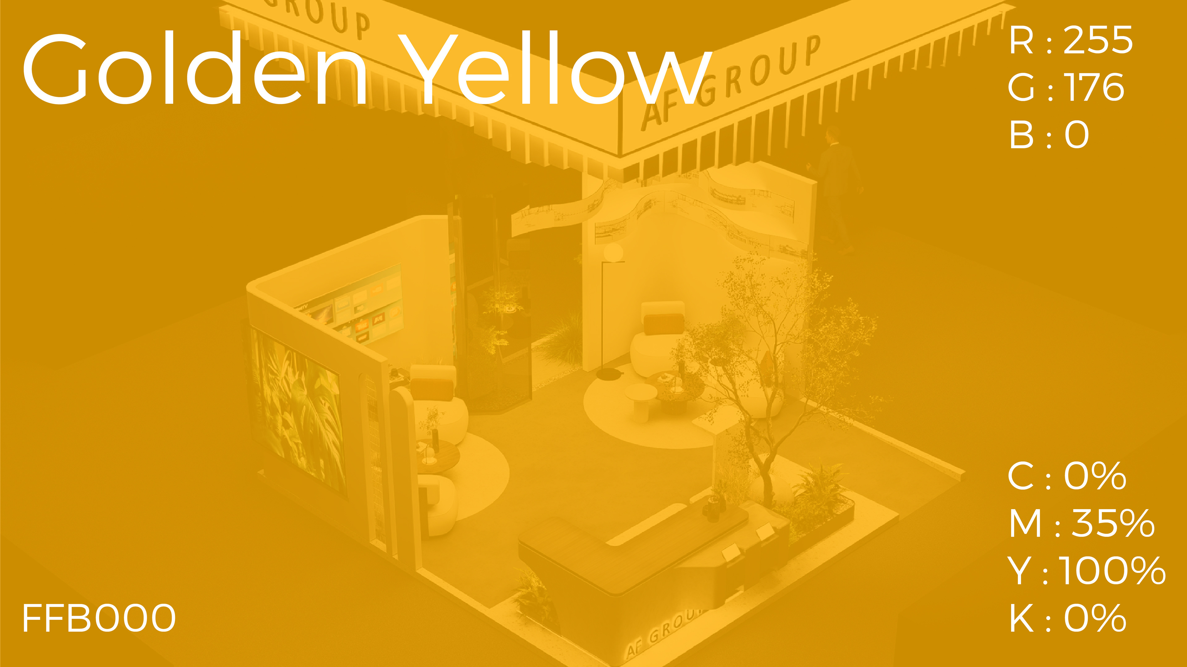
4. FFB000 - Golden Yellow
Psychology : Golden yellow expresses enthusiasm, positivity, and ambition. It is a vibrant color that quickly attracts attention, making it ideal for creating energy and vitality.
Usage : It is usually used as a prominent element or to highlight strengths or special offers, adding vitality and optimism to the identity.
Harmony between them in corporate identity design
Visual balance : Dark blue can be used as the main color in backgrounds and logos, giving the design attractiveness and stability. Bright blue and light blue can be used for balance and adding a sense of modernity and communication.
Attraction and attention : Golden yellow works to add a touch of attractiveness and energy, and is very suitable for elements that need to be highlighted, such as texts, special offers, or buttons.
Benefits in corporate identity design
Professionalism and credibility : Different blue colors give a strong impression of professionalism and credibility, which is very important in the exhibition and conference organization sector.
Creativity and energy : Golden yellow adds an element of vitality and creativity, reflecting the dynamic nature of exhibitions and conferences.
Clarity and Communication : Using bright colors like bright blue promotes a sense of clarity and ease of communication, which is important in a field that requires careful organization and effective communication.
Philosophy of typography
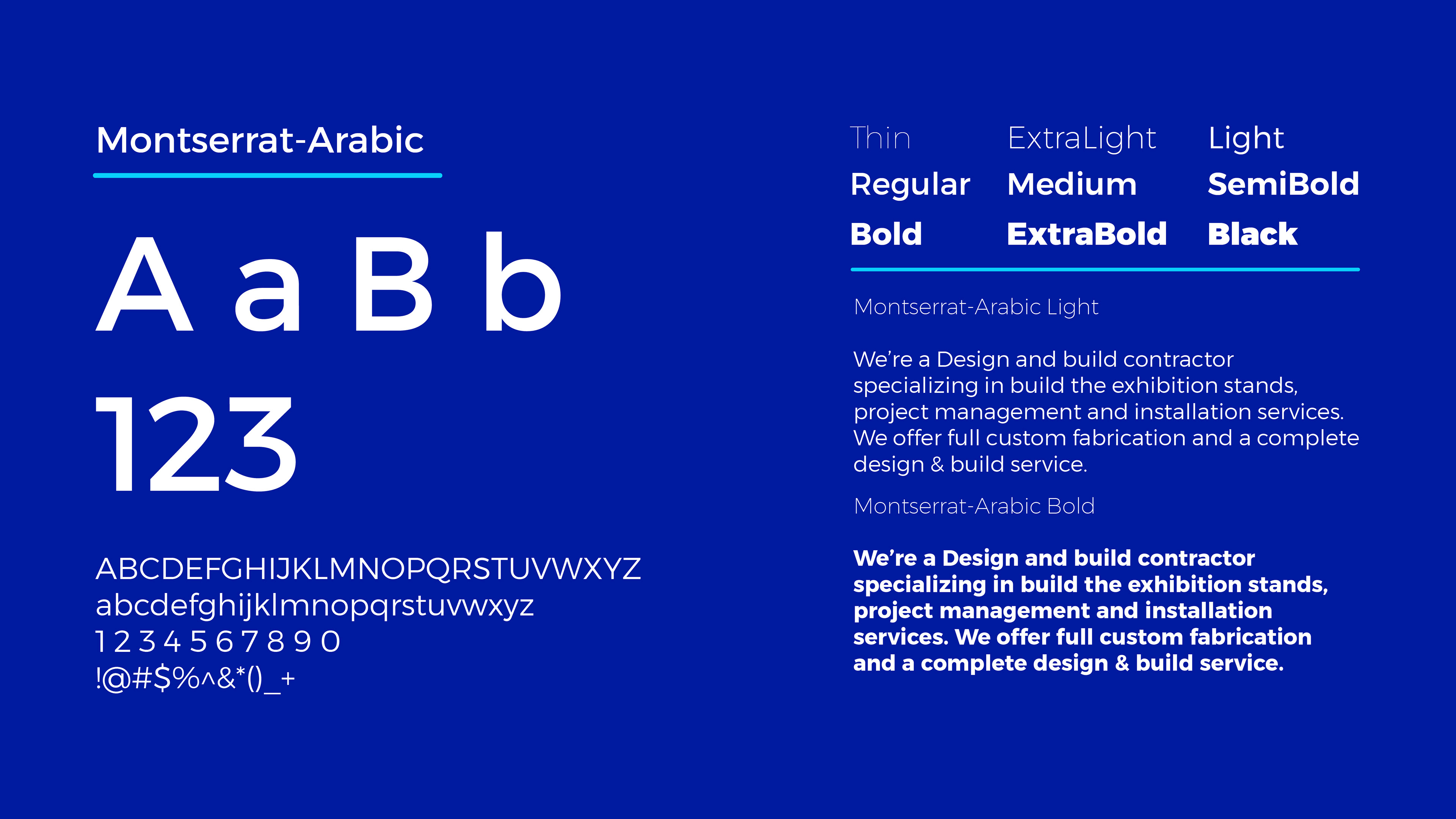
Montserrat-Arabic Font
It is one of the Arabic fonts that enjoys wide popularity in designing corporate visual identities thanks to its modern and flexible design. Here are some points that highlight the philosophy of using this font in the identity of a company working in organizing exhibitions and conferences.
1. Clarity and readability :
Montserrat-Arabic features a clean and clear design, making it easy to read at different sizes. This is vital for companies that deal with a variety of promotional and communication materials, such as banners, brochures, and presentations.
2. Modernity and elegance :
The font provides a modern and elegant look that is in line with companies that seek to present themselves as modern and innovative institutions. This helps in building an attractive and professional brand image.
3. Flexibility and diversity :
Montserrat-Arabic comes in several weights (from very thin to very heavy), allowing for great flexibility in design. Lighter weights can be used for secondary texts and heavier weights for titles and names, ensuring balance and consistency in designs.
4. Cultural Compatibility :
Using a modern Arabic font shows the company’s respect and commitment to the local culture and language, which is essential in markets where Arabic is a primary language.
5. Overall Impression :
Using the Montserrat-Arabic font gives the impression that the company is committed to quality and professionalism. The font itself is a symbol of contemporary aesthetics and can help differentiate the company from competitors.
Choosing Montserrat-Arabic for the identity of the exhibition and conference organization company reflects a combination of modernity, professionalism, and cultural awareness, which enhances the company’s value in the eyes of its clients and partners.
Open to new projects...
Looking for a modern creative logo & brand identity design?
Looking for a modern creative logo & brand identity design?
Let's talk about your projects
Email : ramadanfaahmi@gmail.com
Fast Response
Whatsapp : +966 56 026 3760